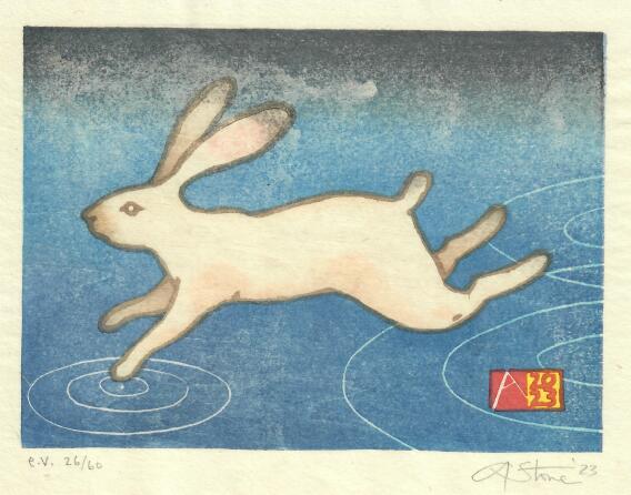
Wednesday, March 8, 2023

Fast Enough-Year of the (water) rabbit


Fast Enought, 2023, 7" X 8"  E.V.-edition size is 60 on sized Japanese machine-made washi.                 

Are you fast enough?

I wasn't planning on making a Chinese zodiac card this year.

But I started drawing rabbits, and hares, and more rabbits, until I filled a few pages of sketchbooks with running, jumping, grazing and flying "Thumpers".  I had wanted to create a busy background full of jerky marks of grass or reeds whizzing by-but the rabbits couldn't decide if they wanted to be white rabbits on a dark ground, or brown rabbits on a green field- and each time I tried to go one way, the rabbits would run back in the other direction. So my white rabbits kept getting beige fur and black ear and tail highlights, and the brown rabbit was never really dark or real enough.  

But then I remembered it was the year of the WATER rabbit.  And that sort of made the background obvious.  

When almost every other animal you meet wants to eat or hurt you,  it's no surprise that running away is the most natural response to almost any stimulus.   But the hares of our fields first do their best not to get noticed.  They blend in to the tall grass and branches, and hunker down, immobile, and are almost impossible to see.  But if you get too close, or startle them with a brusque movement or noise, they will explode from almost underfoot, and rocket away, zig-zagging across the field and will cross a long distance before they will glance back to make sure they're not being followed.  I will never walk on water, but trying not to be noticed, or running away at the first sign from real or imagined conflict, are habits I recognize.

The format was driven by my participation in the BarenForums latest exchange (91).  The paper size is 7" X 8" and 20 copies went to that print exchange. 


The streaking at the top, is from a little too much size-the glue and alum that I added to the paper.


Sunday, June 26, 2022

"Fixing" things? Some of My Favorite Shapes....


 I did this little 4" x 6" pencil sketch on a long flight back from Japan three years ago.  I often fill a sketchbook quickly, filling a page with shapes or doodles, and letting the visual forms trigger ideas or lead to the next drawing.

I usually draw a rectangle, the imaginary "boundary" of my image and fill it with a couple of lines or shapes. This one was a simple idea of basic shapes and primary colors, so I drew a rough square, a simple triangle, and-cramped as I was on the tray table- a quasi- circle....I added a caption, "Some of my favorite Shapes, Hanging out together" and thus it became another etegami--It was too awkward to color it in on the plane, so I turned the page and filled the sketchbook with many other similar drawings. 

 I've gone back often to that notebook and always thought about turning this into a very simple print.  I pulled out a few blocks, some tracing paper, and started to figure out how to interpret this.   One option would be to simply copy it exactly-there are ways to do that and I could reproduce almost exactly my original drawing.  BUT since I have to manually get it onto the wood, there is also an opportunity to adjust or fix the original drawing--maybe moving the text if it looks cramped or awkward, or in this case, maybe tweaking some of those OBVIOUS exaggerations I made in the original drawing (the square is actually a rhomboid, and that circle is NOT a circle)....and I will confess I did get out a compass, and adjust the circle to bring it closer to a geometric shape, straighten out the sides of the square, and tweak the triangle a little bit......

 But, that then makes other things look odd, and I realize that maybe it wasn't a great idea....as a rapid gesture drawing of imagined shapes, it has a quirkiness and spontaneity of something done quickly, just to get an idea on paper, that I really like, and that is very much how I usually do things.  Instead, once it gets corrected, it becomes more of a formal exercise of the relationship of geometric shapes and the negative space surrounding them (things explored very well by LOTS of great artists in the last 100 years)...and now suddenlty the hand-scribbled text also looks awkard, and may have to be redrawn or omitted...?

As I drew various corrected shapes, and played with the text, adding and moving letters to fill the empty spaces,  I tried to see if I could find a happy place between the two approaches. But once I realized that my vacillation was killing any hope of working--I just picked one of my attempts: one closer to a "real" circle and "real" square than the original.  (Made easier by using a collage....).

I'm going to go with this one.

But I still haven't decided whether I'll be carving text, or leaving it out.


Tuesday, May 17, 2022

Inside and outside the Box (Necker Cube)


 I quickly drew this simple cube/3-D illusion (see "Necker cube" if you're curious) as a beginners' exercise for one of my mokuhanga classes from last year. All of the participants carved a keyblock line block of the cube and another of one of the face blocks so they could learn basic and proper carving techniques for lines and solid shapes prior to moving on to their own projects.

I kept their blocks and added a few more to use as demo blocks to show various printing techniques as the class progressed.  I found I liked the roughness of their carving, especially when mixing and superimposing the various duplicates on top of each other.  So after I finished with this group, I printed a few variants on leftover proofing papers.

 Now after a long hiatus myself from carving and printing, I thought I'd pull these out again.
I will be testing my new barens (the Hon-barens I made during the pandemic lockdowns) as well as some odds and ends of poorly labeled paper to warm up again to printing.

It's a bit like doodling with blocks and paper and ink....as I'm building each of these multiples by grabbing blocks and trying to add layers of color to pull forward and push back some of the planes.

Most of these will likely end up in the recycle bin but I might even end up with a couple of one-of-a-kind prints worth keeping. Most of the photos are from my studio, with poor fluorescent lighting and my phone campera lens. Their any LOTS of grays, and they don't photograph well.


This one with the idea of all of the shadows draining from a tipped over box intrigues me enough to try again with better paper and more pigment layers to build some depth and shadow.


Saturday, January 15, 2022

The only tool I have is a hammer and ALL of my problems look like nails....

If your only tool is a hammer, everything looks like a nail. 


This was an etegami that never was. I had the idea to do a postcard of an old hammer and the text was already there, the 60's-era quote from the psychologist Abraham Maslow that "If all you have is a hammer, everything looks like a nail". But I never did the sumi postcard, since I had rapidly sketched an imaginary hammer, and liked how it came out, so modified it to use as a sample print for a workshop demo. The simple line drawing was easy to turn into 4 separate plates and to show how to transfer the image and to demonstrate carving.

But that was in NOVEMBER, and with just 4 blocks, and rather straightforward colors, this print should have been done in just a few days. But times are strange, and between Covid lockdowns, waves of infection that kept me out of the studio, the need to take care of garden/outdoor projects or to assist with family matters meant that the prints got started, then stashed in the freezer multiple times. A small loss of line in a key block I wasn't sure I was going to use needed a repair, and further work was delayed by the Winter and New Year Holidays. But I finished one set of proofs, shown above. You can see very pronounced goma-zuri (speckling) that I think was due to me using either too strong a size (too much alum) or mistakenly sizing the same sheet twice....the background block should have printed the shina grain. But I like how this came out.
The top photo is a proof I finished today. It was printed on Awagami heavyweight kozo, a machine-made paper to which I've added additional sizing--there is another set, on natural-color kozo that I hope to finish early next week and on which I want to try the original idea--a version without a keyblock, using just the overlapping color plates to create defining borders to separate the shapes and forms. Either way, and despite starting this in November, this is my First Print of 2022.....

Thursday, May 6, 2021

Brayer Paintings-trace monotypes and drawings


"And Just Like that It was over. "

I have a folder of work that I've been creating, off-and-on, for a half-dozen years. These odd, mostly abstract or vaguely recognizable images I've been calling brayer paintings but they are more correctly referred to as transfer monotypes and/or ink drawings, created by drawing or painting directly onto the paper with a brayer, or indirectly by the transfer of ink off a glass plate by rubbing or marking a sheet of paper from the back, while it is face-down on a inked glass slab.  

 While I mostly work with water-based pigments and the Japanese method of woodblock prints,  I make traditional western prints too--drypoints and etchings and also occasional works incorporating letterpress text, all of which are printed using oil-based relief inks, usually rolled onto a slab or glass plate, and then transferred to the plate or mobile type. After the day's work is over, clean-up means getting the excess ink off the plate,  first by scraping it off with a piece of scrap cardstock or by placing newsprint on the plate and rubbing that to get the ink off before using vegetable oil and soap and water to wash the plate and brayer. 


Untitled, (Failing Memory)


But as I noticed that I sort of liked the newsprint or paper towels that I lifted off the glass, the ink transferred to the face down surface, it was an easy thing to start making them on purpose,  using clean pieces of bond paper--acid free printing (xerox) paper--and deliberately working to pull off ink in a semi-guided way. I could lay the clean paper face down on the inked slab, and then rub it with my fingers or fingernails, the back handle of a paintbrush or any simple implement.On others, I worked directly with the brayer, using it to draw on the paper directly and layering thin and thick layers of ink.


"Sleep and Death" (two doors).


I liked the results, but realized that I should try to use good paper rather than copy paper.  However using paper of better quality made it much harder to work freely. With good Japanese paper,  there is always a hesitation and fear of "wasting" an expensive piece of handmade paper by making a mistake or ruining a promising start, and that hindered the spontaneity and directness that made these simple works interesting.  

I solved that by (for the most part) by cutting down whole sheets into A4 size and having a folder--at hand--and reserved for just this purpose. With a folder full of paper, it's been a little easier to work without worrying too much about making a mistake.  So at the end of my occasional oil-based projects, I usually find time to make 1 or 2 pieces using the leftover ink and the wet brayer. 

I consider these part drawing, part painting, and part printmaking. They start off as abstract markings, but gradually they start to get pushed into a direction guided by the evolving image.  Like passing clouds that take on the likeness of animals or figures, my ink-slab drawings start to suggest subjects and titles. 


"Passing Storm" 2020  


Well see how far these can go.  I'd like to work a little bigger--try with a bigger brayer and a full sheet of paper--or go even bigger but with both bigger and smaller brayers or ink rollers....the key is to keep making them, without thinking too much. 


Sunday, February 28, 2021

Inclined Plane: (What will it take to move me?).


The Inclined plane is one of the 6 simple machines, used since ancient times to aid in construction or move masses of stone, or materials up or down.  By increasing the distance traveled, the amount of force needed is decreased when compared to hauling the same weight straight up or down. Blocks of stone were hauled up long ramps to build the pyramids and the blocks of Italian marble were slid from the quarries, miles to the sea using sloped ramps and rolling logs and teams of oxen to ship by boat to Rome and the rest of the world. The forces acting are gravity, pulling downwards, inertia, a body's resistence to movement based on it's mass, and friction, the resistence to sliding based on the nature of the materials and their surfaces. Increasing the slope, decreasing the coefficient of friction (by oiling or wetting the surface), or applying an outward force (pushing or pulling) will all aid in moving any object up or down the ramp. 

But this was intended as a metaphor and not a physics problem.  I've been stuck for a while, not with creative block, I have a book of ideas of prints and images I want to explore, but with something else.  I can't seem to get anything done.  I've a desk and studio full of unfinished work and many more never started.  And the BIG things, changes I need to make in my life and for my career, sit in a stack, getting taller as it also gets buried, by all the things that I let pile up and take precedence over the important, or distract me, long enough, so it's too late most every day to even think about tackling my problems.

So, it's been a long time since I really worked on a new woodblock print. The combination of the COVID-19 pandemic, quarantines and lockdowns and the political upheaval in the USA and Italy have had me fairly paralyzed, glued to the computer trying to figure out what's happening next or wondering about the future.  So when the Barenforum called for participants in their next print exchange,  in a simple format and without a theme,  I decided to take the hint, and sign up, hoping that the deadline would help push me to start working again. 

This was meant to be a simple image of a dark block, sitting on a steep slope at the borderline of what would visually feel like it might want to move, or slip, on it's own, or with a little help. One has to imagine the forces preventing any movement--inertia, maybe laziness, fear of failure or habits of self-sabatoge, the frictions of daily life: my duties as parent or husband, taxes, a mortgage, family conflicts very near and far away, ageing parents and troubled children, the quiet and odd newness of an ageing body and the subtle return of hints of illnesses known but never really conquered or new, disquieting symptoms that whisper menace with all the things that any little thing might portend. 

                                                                                                                                                                                                                                                                                                                                                                                                                                                                                                                                                                                                                                                                                                                                                                                                                                                                                                                What to do?

 I can increase the slope. Sooner or later, I'll start to slip and then accelerate downhill.  I can try to smooth the rough parts on the path, make the rough and irregular road, smooth and slippery. Or I can wait for some inevitable, eventual, external force--maybe positive: such as an invition to participate in a print exchange or residency, or a commission, or an exciting idea that just begs to be worked on, or negative one--a major life event or disruption--that forces me finally to change or startles me into flight.  But either way, like it or not, I have the sense that once it comes, and I start to slip and accelerate downhill,  it may not be possible to control how fast or far I go, or stop if I want to.

"Inclined Plane" "What does it take to move me?"  8" x 10" Mokuhanga watercolor woodblock with handwritten text. Edition Varié, 30 copies on off white or beige Japanese kozo paper.  9 color impressions from six plywood blocks with Sumi ink, watercolor pigments and rice paste. 


An early sketch


Sunday, March 29, 2020

Year of the RAT

NOTE: I started working on this little print in November 2019 and finished mailing them out in late February....just as the COVID-19 was just beginning to migrate out of China and into Italy.  I certainly didn't expect that the epidemic that started in Wuhan would spread so far and so fast, and my folded-paper, mouse/rat was supposed to be an innocent and gentle reminder of the fragility and transient nature of all things....

 The Rat is the first of the 12 animals that make up the 12-year cycle of the Chinese Zodiac and as this year also marks the beginning a new decade, it was supposed to be a year of good and auspicious beginnings.  I began working on this print in November--as I used it as a class project for my beginners' woodblock class in Florence's art and culture center,  L'Appartamento.  Using the traditional method of working in which the carvers and printers would have worked from a simple sketch--I provided the students with my drawing of an origami rat (mouse) and the students became first the carvers and then the printers of the blocks that were needed to print the color print version. Along the way I got to show them the hanshita method of image transfer that allows a reliable way to ensure that the multiple color blocks will register to the black and white keyblock, much as they would have done in the Ukiyo-e workshops of Japan 150 years ago.


 I was able to combine my student-cut color plates and with my key block (with the addition of another color block to allow some bokashi gradation printing) using the combination of plates to print this year's "YEAR of the RAT" greeting card.

Shina plywood key block (before removing the corner marks).

An early proof in B&W and gray

I also printed them on a mix of papers, although the majority were printed on Western papers--Magnani incisioni, Fabriano Artistico and Arches 180lb cotton etching papers instead of Japanese washi.   That let me have cards that had a thick, postcard-like heft but also gave them the slightly grainy, textured look that mokuhanga prints get when they're printed on Western papers.

Of the 125 copies I printed, about 40 went to the Baren Zodiac exchange, another 40 to colleagues and collectors, and about another 40 to family and friends.

As I wrote above, my little zodiac print was supposed to represent a good-luck, origami mouse--but this was not the kind of luck or 2020 I was expecting.  I hope the current international health and social disaster ends soon and that the toll on human life and suffering of all things in the natural world are not greater than we can bear and that we remember to help each other through the difficult times ahead--the more fortunate assisting those in need.