Showing posts with label mokuhanga. Show all posts

Friday, March 1, 2024

Dragons-A Good Start to 2024 (Maybe it's the battery?....)

Year of the Dragon, mokuhanga, 4.5"x6.5"


My car battery dies often enough that I keep a pair of jumper cables behind the driver's seat. So, I've been eyeing those cables and thinking how suitable they were for an etegami for some time but hadn't really figured out a suitable text to go with the drawings I contemplated painting.

But 2024 is the year of the Dragon according to the Chinese Zodiac and while I wasn't planning on making a Lunar New Year's card this year, I knew I was going to try and make it to the big Hokusai exhibit in Seattle in January, and when I started thinking about Hokusai, I couldn't help thinking of his big Sumi self-portraits as a dragon......


And so,  I started drawing jumper cables, but thinking about dragons.

A) This was more calligraphic and suggesting a dragon flying.


But when I showed various family members and acquaintences (and a few strangers) my pages of sketches, "B" was the unanimous choice.  While I don't often yield to family taste (pressure) and I'm still not sure I made the right decision but......


Wednesday, June 28, 2023

Go Figure: Bad Kitty

Oooooooh! I LOVE this.....Is it for sale?

"BAD" Kitty   

I was curious about the traditional way of printing white-line prints, using a wooden spoon rather than a baren and printing on dry paper, tacked along one edge to the board. 

So during a short wait between other commitments, I hastily cut a cat doodle I had done earlier onto a small 4 x 7" block of a poor-quality, scrap plywood. 

It's a funny process: flip up the paper, paint a small area of the block (the lines have been excised away) and fold the paper down and burnish it with a wooden spoon. Each area USUALLY needs to be printed at least twice and the ultimate effect is a little like a coloring book, with the drawing in white.

Being hastily done, everything went as you'd expect. The cheap plywood's grain would suck the paint across the borders, the paper was thick and hard to print on, and my ink drawing bled a bit into the paper during printing. 

BUT,  since I didn't really care how it came out,  I worked fast and loosely with the colors, ignoring the smudges and pale areas. 

The First visitor to my studio while I was working made a beeline to my workstation.
"Oooooh! I love this, Is it for Sale?" and I replied, "Um, well No, it's not finished yet, and its really just an exersize to see if I like this method......", I replied replied rather clumsily..

The Second visitor to my studio (and I rarely get visitors). ALSO immediately asked if the little ugly print was for sale? or could they buy the block!!!

 My son stopped by with some friends from the UK....."I LOVE this, can I have it!?!"

???? Is it a cat person thing?!?!

 Here's the more carefully printed version. This one is a little too dark in the brown areas (which i do like better in the first version). 

"Good" Kitty


 I THINK I'll try to redraw and recut this and start again.   I'm fond of Siamese cats, I've always wanted to do a print of one, and I guess there's a niche to fill.

Friday, June 23, 2023

Not on Speaking Terms-Amaryllis


Not on Speaking Terms, White-line Woodblock print, 8 1/4" x 11 3/4"


I buy an Amaryllis bulb/plant almost every year. I love how dramatic they are, the rising bud is just interesting enough without being threatening or too obscene and I like the fact that the budding and bloom last quite a long time.
This particular plant was one of the few that survived from last year to bloom again. I didn't give it the attention it deserved, so it wasn't as vigorous or as energetic as the first year, and it made only 2 buds, instead of the usual 3-4.
And with just two blooms--Siamese-twins joined at the shoulders--they must have had quarrelled, as they grew with their flowers facing in opposite directions. And they kept this haughty posture, neither really accepting nor acknowledging the other's face or presence.
Despite being nearer and more alike than perhaps they'd have liked to admit, and despite sharing the single stem and bulb, they budded, bloomed, and then withered away next to each other, but alone. 
 
Who knows what they were mad about, maybe even they don't remember.

This fall, I'll pot them again with some new soil and a bigger pot and the hope that next year they will not simply flower, but wake with enough vigor to shed their grudges and ready to grow.


Wednesday, March 8, 2023

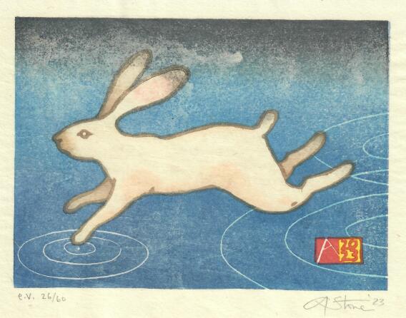
Fast Enough-Year of the (water) rabbit


Fast Enought, 2023, 7" X 8"  E.V.-edition size is 60 on sized Japanese machine-made washi.                 

Are you fast enough?

I wasn't planning on making a Chinese zodiac card this year.

But I started drawing rabbits, and hares, and more rabbits, until I filled a few pages of sketchbooks with running, jumping, grazing and flying "Thumpers".  I had wanted to create a busy background full of jerky marks of grass or reeds whizzing by-but the rabbits couldn't decide if they wanted to be white rabbits on a dark ground, or brown rabbits on a green field- and each time I tried to go one way, the rabbits would run back in the other direction. So my white rabbits kept getting beige fur and black ear and tail highlights, and the brown rabbit was never really dark or real enough.  

But then I remembered it was the year of the WATER rabbit.  And that sort of made the background obvious.  

When almost every other animal you meet wants to eat or hurt you,  it's no surprise that running away is the most natural response to almost any stimulus.   But the hares of our fields first do their best not to get noticed.  They blend in to the tall grass and branches, and hunker down, immobile, and are almost impossible to see.  But if you get too close, or startle them with a brusque movement or noise, they will explode from almost underfoot, and rocket away, zig-zagging across the field and will cross a long distance before they will glance back to make sure they're not being followed.  I will never walk on water, but trying not to be noticed, or running away at the first sign from real or imagined conflict, are habits I recognize.

The format was driven by my participation in the BarenForums latest exchange (91).  The paper size is 7" X 8" and 20 copies went to that print exchange. 


The streaking at the top, is from a little too much size-the glue and alum that I added to the paper.


Sunday, June 26, 2022

"Fixing" things? Some of My Favorite Shapes....


 I did this little 4" x 6" pencil sketch on a long flight back from Japan three years ago.  I often fill a sketchbook quickly, filling a page with shapes or doodles, and letting the visual forms trigger ideas or lead to the next drawing.

I usually draw a rectangle, the imaginary "boundary" of my image and fill it with a couple of lines or shapes. This one was a simple idea of basic shapes and primary colors, so I drew a rough square, a simple triangle, and-cramped as I was on the tray table- a quasi- circle....I added a caption, "Some of my favorite Shapes, Hanging out together" and thus it became another etegami--It was too awkward to color it in on the plane, so I turned the page and filled the sketchbook with many other similar drawings. 

 I've gone back often to that notebook and always thought about turning this into a very simple print.  I pulled out a few blocks, some tracing paper, and started to figure out how to interpret this.   One option would be to simply copy it exactly-there are ways to do that and I could reproduce almost exactly my original drawing.  BUT since I have to manually get it onto the wood, there is also an opportunity to adjust or fix the original drawing--maybe moving the text if it looks cramped or awkward, or in this case, maybe tweaking some of those OBVIOUS exaggerations I made in the original drawing (the square is actually a rhomboid, and that circle is NOT a circle)....and I will confess I did get out a compass, and adjust the circle to bring it closer to a geometric shape, straighten out the sides of the square, and tweak the triangle a little bit......

 But, that then makes other things look odd, and I realize that maybe it wasn't a great idea....as a rapid gesture drawing of imagined shapes, it has a quirkiness and spontaneity of something done quickly, just to get an idea on paper, that I really like, and that is very much how I usually do things.  Instead, once it gets corrected, it becomes more of a formal exercise of the relationship of geometric shapes and the negative space surrounding them (things explored very well by LOTS of great artists in the last 100 years)...and now suddenlty the hand-scribbled text also looks awkard, and may have to be redrawn or omitted...?

As I drew various corrected shapes, and played with the text, adding and moving letters to fill the empty spaces,  I tried to see if I could find a happy place between the two approaches. But once I realized that my vacillation was killing any hope of working--I just picked one of my attempts: one closer to a "real" circle and "real" square than the original.  (Made easier by using a collage....).

I'm going to go with this one.

But I still haven't decided whether I'll be carving text, or leaving it out.


Tuesday, May 17, 2022

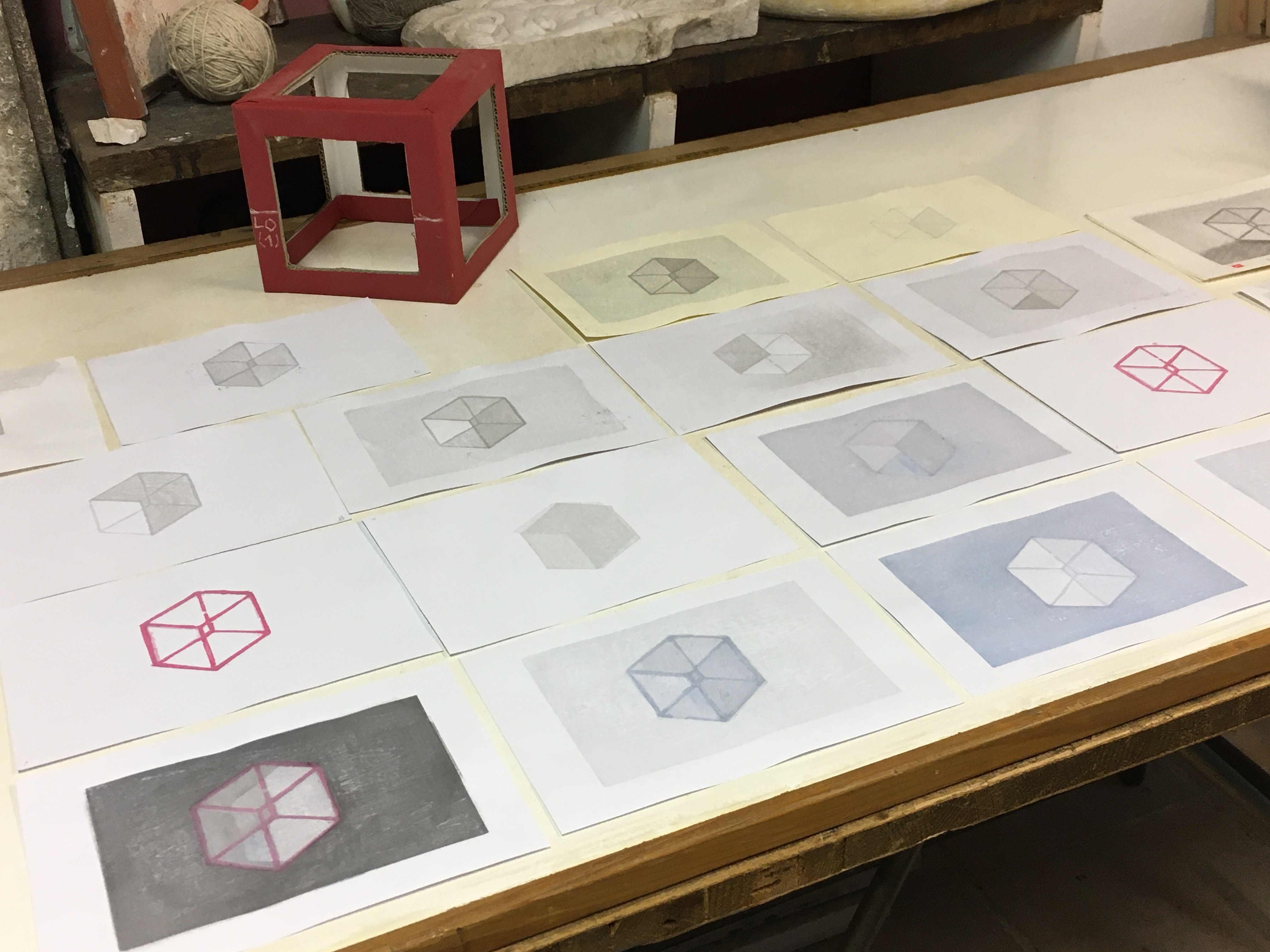
Inside and outside the Box (Necker Cube)


 I quickly drew this simple cube/3-D illusion (see "Necker cube" if you're curious) as a beginners' exercise for one of my mokuhanga classes from last year. All of the participants carved a keyblock line block of the cube and another of one of the face blocks so they could learn basic and proper carving techniques for lines and solid shapes prior to moving on to their own projects.

I kept their blocks and added a few more to use as demo blocks to show various printing techniques as the class progressed.  I found I liked the roughness of their carving, especially when mixing and superimposing the various duplicates on top of each other.  So after I finished with this group, I printed a few variants on leftover proofing papers.

 Now after a long hiatus myself from carving and printing, I thought I'd pull these out again.
I will be testing my new barens (the Hon-barens I made during the pandemic lockdowns) as well as some odds and ends of poorly labeled paper to warm up again to printing.

It's a bit like doodling with blocks and paper and ink....as I'm building each of these multiples by grabbing blocks and trying to add layers of color to pull forward and push back some of the planes.

Most of these will likely end up in the recycle bin but I might even end up with a couple of one-of-a-kind prints worth keeping. Most of the photos are from my studio, with poor fluorescent lighting and my phone campera lens. Their any LOTS of grays, and they don't photograph well.


This one with the idea of all of the shadows draining from a tipped over box intrigues me enough to try again with better paper and more pigment layers to build some depth and shadow.


Saturday, January 15, 2022

The only tool I have is a hammer and ALL of my problems look like nails....

If your only tool is a hammer, everything looks like a nail. 


This was an etegami that never was. I had the idea to do a postcard of an old hammer and the text was already there, the 60's-era quote from the psychologist Abraham Maslow that "If all you have is a hammer, everything looks like a nail". But I never did the sumi postcard, since I had rapidly sketched an imaginary hammer, and liked how it came out, so modified it to use as a sample print for a workshop demo. The simple line drawing was easy to turn into 4 separate plates and to show how to transfer the image and to demonstrate carving.

But that was in NOVEMBER, and with just 4 blocks, and rather straightforward colors, this print should have been done in just a few days. But times are strange, and between Covid lockdowns, waves of infection that kept me out of the studio, the need to take care of garden/outdoor projects or to assist with family matters meant that the prints got started, then stashed in the freezer multiple times. A small loss of line in a key block I wasn't sure I was going to use needed a repair, and further work was delayed by the Winter and New Year Holidays. But I finished one set of proofs, shown above. You can see very pronounced goma-zuri (speckling) that I think was due to me using either too strong a size (too much alum) or mistakenly sizing the same sheet twice....the background block should have printed the shina grain. But I like how this came out.
The top photo is a proof I finished today. It was printed on Awagami heavyweight kozo, a machine-made paper to which I've added additional sizing--there is another set, on natural-color kozo that I hope to finish early next week and on which I want to try the original idea--a version without a keyblock, using just the overlapping color plates to create defining borders to separate the shapes and forms. Either way, and despite starting this in November, this is my First Print of 2022.....

Sunday, February 28, 2021

Inclined Plane: (What will it take to move me?).


The Inclined plane is one of the 6 simple machines, used since ancient times to aid in construction or move masses of stone, or materials up or down.  By increasing the distance traveled, the amount of force needed is decreased when compared to hauling the same weight straight up or down. Blocks of stone were hauled up long ramps to build the pyramids and the blocks of Italian marble were slid from the quarries, miles to the sea using sloped ramps and rolling logs and teams of oxen to ship by boat to Rome and the rest of the world. The forces acting are gravity, pulling downwards, inertia, a body's resistence to movement based on it's mass, and friction, the resistence to sliding based on the nature of the materials and their surfaces. Increasing the slope, decreasing the coefficient of friction (by oiling or wetting the surface), or applying an outward force (pushing or pulling) will all aid in moving any object up or down the ramp. 

But this was intended as a metaphor and not a physics problem.  I've been stuck for a while, not with creative block, I have a book of ideas of prints and images I want to explore, but with something else.  I can't seem to get anything done.  I've a desk and studio full of unfinished work and many more never started.  And the BIG things, changes I need to make in my life and for my career, sit in a stack, getting taller as it also gets buried, by all the things that I let pile up and take precedence over the important, or distract me, long enough, so it's too late most every day to even think about tackling my problems.

So, it's been a long time since I really worked on a new woodblock print. The combination of the COVID-19 pandemic, quarantines and lockdowns and the political upheaval in the USA and Italy have had me fairly paralyzed, glued to the computer trying to figure out what's happening next or wondering about the future.  So when the Barenforum called for participants in their next print exchange,  in a simple format and without a theme,  I decided to take the hint, and sign up, hoping that the deadline would help push me to start working again. 

This was meant to be a simple image of a dark block, sitting on a steep slope at the borderline of what would visually feel like it might want to move, or slip, on it's own, or with a little help. One has to imagine the forces preventing any movement--inertia, maybe laziness, fear of failure or habits of self-sabatoge, the frictions of daily life: my duties as parent or husband, taxes, a mortgage, family conflicts very near and far away, ageing parents and troubled children, the quiet and odd newness of an ageing body and the subtle return of hints of illnesses known but never really conquered or new, disquieting symptoms that whisper menace with all the things that any little thing might portend. 

                                                                                                                                                                                                                                                                                                                                                                                                                                                                                                                                                                                                                                                                                                                                                                                                                                                                                                                What to do?

 I can increase the slope. Sooner or later, I'll start to slip and then accelerate downhill.  I can try to smooth the rough parts on the path, make the rough and irregular road, smooth and slippery. Or I can wait for some inevitable, eventual, external force--maybe positive: such as an invition to participate in a print exchange or residency, or a commission, or an exciting idea that just begs to be worked on, or negative one--a major life event or disruption--that forces me finally to change or startles me into flight.  But either way, like it or not, I have the sense that once it comes, and I start to slip and accelerate downhill,  it may not be possible to control how fast or far I go, or stop if I want to.

"Inclined Plane" "What does it take to move me?"  8" x 10" Mokuhanga watercolor woodblock with handwritten text. Edition Varié, 30 copies on off white or beige Japanese kozo paper.  9 color impressions from six plywood blocks with Sumi ink, watercolor pigments and rice paste. 


An early sketch


Sunday, March 29, 2020

Year of the RAT

NOTE: I started working on this little print in November 2019 and finished mailing them out in late February....just as the COVID-19 was just beginning to migrate out of China and into Italy.  I certainly didn't expect that the epidemic that started in Wuhan would spread so far and so fast, and my folded-paper, mouse/rat was supposed to be an innocent and gentle reminder of the fragility and transient nature of all things....

 The Rat is the first of the 12 animals that make up the 12-year cycle of the Chinese Zodiac and as this year also marks the beginning a new decade, it was supposed to be a year of good and auspicious beginnings.  I began working on this print in November--as I used it as a class project for my beginners' woodblock class in Florence's art and culture center,  L'Appartamento.  Using the traditional method of working in which the carvers and printers would have worked from a simple sketch--I provided the students with my drawing of an origami rat (mouse) and the students became first the carvers and then the printers of the blocks that were needed to print the color print version. Along the way I got to show them the hanshita method of image transfer that allows a reliable way to ensure that the multiple color blocks will register to the black and white keyblock, much as they would have done in the Ukiyo-e workshops of Japan 150 years ago.


 I was able to combine my student-cut color plates and with my key block (with the addition of another color block to allow some bokashi gradation printing) using the combination of plates to print this year's "YEAR of the RAT" greeting card.

Shina plywood key block (before removing the corner marks).

An early proof in B&W and gray

I also printed them on a mix of papers, although the majority were printed on Western papers--Magnani incisioni, Fabriano Artistico and Arches 180lb cotton etching papers instead of Japanese washi.   That let me have cards that had a thick, postcard-like heft but also gave them the slightly grainy, textured look that mokuhanga prints get when they're printed on Western papers.

Of the 125 copies I printed, about 40 went to the Baren Zodiac exchange, another 40 to colleagues and collectors, and about another 40 to family and friends.

As I wrote above, my little zodiac print was supposed to represent a good-luck, origami mouse--but this was not the kind of luck or 2020 I was expecting.  I hope the current international health and social disaster ends soon and that the toll on human life and suffering of all things in the natural world are not greater than we can bear and that we remember to help each other through the difficult times ahead--the more fortunate assisting those in need. 

Saturday, January 26, 2019

Year(s) of the Boar--an Old boar for a New Year.


S's original 2007 drawing/prototype.
February 5th marks this year's Chinese New Year.
According to the Asian Zodiac, 2019 is the year of the Boar, the last Pig year being 12 years ago in 2007, and THIS year, I've decided to reproduce a drawing done 12 years ago by my younger son, S.
It's a story that many know already.
In 2007, I had just started making woodblock prints and I had intended to join that year's Baren Forum Zodiac Exchange (the sign-up closed before I could join so my print wasn't included).
As is my usual working method, I made thumbnail sketches, redrew and redrew while looking at multiple images from the internet. The prep stages took a couple of weeks before I decided on an image that was then carved and printed for the Year of the Boar, 2007.  But S wasn't really interested in signing a family card and said he would make one of his own. So he disappeared for about 25 minutes and came back with the image you see above. We were thrilled with his drawing and photocopied it to include inside the envelope with my card. But he was clearly unhappy and he became more and more disturbed until he finally burst into tears, distraught and inconsolable over the idea that he couldn't draw as well as I did.
I made it worse by laughing at the obvious--and I tried to convince him what I knew to be the truth, that his drawing was original, and funny, and wonderfully creative and perfect and much, much, much better than mine. (He didn't believe me).  I promised then that the next year (Year of the Rat) he would design the family card (and he did).

Now it's 2019 and S. is now 18. He doesn't draw as much as I'd like, and he's into Manga, so much of what he does draw looks a little too much like rather anonymous Japanese or Korean manga. But he's also learning Japanese and hopes to visit Japan next year after he finishes high school. And 12 years later I still think his boar is fantastic and he accepted my proposal to use it for this year's greeting card.  He made a couple of adjustments, adding the Kanji symbol for "Boar" and the "new" year-- 2019.  And I removed the text at the bottom to make it easier to print and carve.
The new key block, from tracing the old and carving it from a linoleum block.

Two of the color blocks printed.

2019 Year of the Boar (Proof)

 I tried to keep it as close as possible to the original sketch. There is a linoleum key block and 3 additional wood blocks for the color plates. (Yellow(background), Brown (Boar body/head), and a mixed block to print the pink snout, the tan trotters and the bokashi-stained tusks of our spirited boar. All were printed with watercolors, sumi ink, and rice paste using a baren. 

Wednesday, December 5, 2018

I may never finish my novel....


The blue-gray of the ferrule isn't showing up in the scan.
  This print began as an etegami--another of the small Japanese mail-art cards I make.  It was done during my first Etegami workshop, where I used a small pencil stub to make 3 different simple sumi ink and watercolor drawings, with added text.  I knew right away one would become a print.
I also have a novel and probably a few short stories in me--although I doubt any will ever get written.

This is a simple image, but getting it carved and printed has posed a few hurdles.
I enlarged the size of the work from postcard-size (3"x5") to an easier to carve 8" x 10" to make it less likely that I'd have too much trouble cutting the text but I still had the top half of one of the "e"s pop off;  I had to re-glue and re-cut a repair 3 times due to glue failure the first time, wrong glue (too elastic) the second time, and (fingers crossed) the last repair seems to be holding.  Mostly I've had a hard time getting into the studio with enough protected time to just get it done.

The above copy/proof is on Fabriano Artistico--a thick, Italian watercolor paper but there are still a few things to work out:
   The original drawing was done on a postcard--so it had a natural boundary (the paper edges) and the drawing "happened" with that scale in mind, but printed on a bigger sheet, it now has a much larger outer border of white paper--and I can either leave it like that  or print a very faint rectangle of very pale color (it's called a Beta-ban block)--that would recreate the original horizontal, small format on the bigger sheet.  This variant still needs to be finished as well as a few more that have a different block order to see if it changes the final look.

Here's the original etegami watercolor and sumi ink postcard.

This print, is pretty close to recreating the original--I did tweak the pencil in a few places, lessening the slightly phallic droop of the point. I also pushed the text over a little bit, and reversed the chop (white letter on red field).


Tomorrow, I'll finish printing the rest of the proofs. That will allow me to see what they look like with the background block before I cut down the rest of the paper and print the final version or full edition.


This set on Japanese paper is almost done. They lack just the two yellow layers of the pencil wood and the sumi ink "keyblock" and text.  I'll post a finished version of these too as soon as they're done.

You can't see the beautiful gray-blue of the metal ferrule--it won't pick up with the scanner but it really goes well with the orange-y pencil and pink eraser.

Sunday, September 30, 2018

October News-Tattoos, Mokuhanga and Etegami

October is just around the corner and I'm busy preparing for some new experiences.


DEMO: Next weekend, as a guest of the Lacrimanera Tattoo Studio, I will be demonstrating Japanese woodblock printing at the Florence Tattoo Convention.
This year the 11th edition of the Florence Tattoo Convention is partially dedicated to the history of Japanese tattoos (and their inherent relationship to modern tattoo's ever increasing interest in the works of the Ukiyo-e as subject matter.  Thanks to Ivan Pengo and Milan's Stamperia 74b and Florence's Lacrimenera Tattoo Studio, there will be an exhibit of the wonderful Adachi Institute woodblocks reproducing well-known masterpieces of the Ukiyo-e by Utamara, Kunioshi, and Hokusai and as part of that show, I've been asked to demonstrate Japanese woodblock printing during the Convention.  I'll be present all day Friday (3p-2a) and Sunday (noon-2am) and I'll have a dedicated table where I'll have blocks, prints, paper and other materials and hope to be carving and printing and working on a new print during the convention.  If I'm not too exhausted, I'll try to be there also on Saturday, and I'll be working on a new print with both carving and printing demos during the day.
So If you fascinated by tattoos, or fascinated by mokuhanga, there will be both at the Fortezza da Basso in Firenze next weekend.  I'll be at Stand 4, just inside the main entrance.

WORKSHOP Later in the month, if you are tired of just watching, you can learn how to make your own woodblock prints at my next mokuhanga course. For the weekend of  October 19-21, I'll be in Ravenna, Italy for my next 3-day, beginner's Mokuhanga Workshop. I'm hosted by Enrico Rambaldi and Ink33 and there are still places in this usually sold-out workshop in a wonderful city famous for it's phenomenal Byzantine mosaics. For information: infoink33@gmail.com

ETEGAMI And on Sunday afternoon, October 28th from 2pm-6pm I'll be giving an Etegami workshop at L'Appartamento, Via dei Geraldi,  in downtown Florence.   Well use sumi ink, watercolor and Japanese paper postcards to marry art and text with a lighthearted technique perfect for writers who want to illustrate their writings or artists who want to try adding text to spontaneous sketches drawn/painted on absorbent paper postcards.  Save the date and I'll post more information soon.....


Tuesday, May 29, 2018

Color Test Strips


I've been meaning to do this for almost as long as I've been making woodblock prints.
Mokuhanga prints usually are made with transparent colors and the nature of printing from an imperfect surface (wood grain) onto another imperfect surface (paper fibers) with a handheld device (a baren) that allows a great deal of variability in the pressure obtained means that the final result is often not fully predictable.


I do know that whenever to color layers are printed--either the same or different colors, the result is almost always both denser and richer than that you can obtain by just increasing the pigment or mixing the colors in just one pass or impression.

Here are a few test strips made with a fairly simple model.
There's a single block with 5 squares and the block is printed with a color mixture made up of 50% pigment (from tube watercolors) and 50% rice paste. The entire block is printed once, and then with each following impression one less square is printed.
The end result is 5 separate squares each printed with the same color mixture but with a varying number of impressions. The first block was printed only once, the second twice, the third three times, etc.
The results show the buildup of pigment and overall tonal strength obtained by multiple impressions.
I could have gotten a much lighter 1st square by using even more dilute pigment and I could have gotten a much darker final square by adding additional pigment each time to increase the pigment load above 50%.

The next step is to do a color grid, showing the effects of overlapping the primary colors to obtain secondary and tertiary colors.