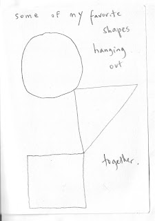
I did this little 4" x 6" pencil sketch on a long flight back from Japan three years ago. I often fill a sketchbook quickly, filling a page with shapes or doodles, and letting the visual forms trigger ideas or lead to the next drawing.
I usually draw a rectangle, the imaginary "boundary" of my image and fill it with a couple of lines or shapes. This one was a simple idea of basic shapes and primary colors, so I drew a rough square, a simple triangle, and-cramped as I was on the tray table- a quasi- circle....I added a caption, "Some of my favorite Shapes, Hanging out together" and thus it became another etegami--It was too awkward to color it in on the plane, so I turned the page and filled the sketchbook with many other similar drawings.
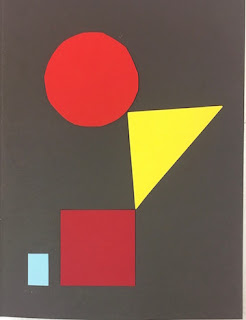
I've gone back often to that notebook and always thought about turning this into a very simple print. I pulled out a few blocks, some tracing paper, and started to figure out how to interpret this. One option would be to simply copy it exactly-there are ways to do that and I could reproduce almost exactly my original drawing. BUT since I have to manually get it onto the wood, there is also an opportunity to adjust or fix the original drawing--maybe moving the text if it looks cramped or awkward, or in this case, maybe tweaking some of those OBVIOUS exaggerations I made in the original drawing (the square is actually a rhomboid, and that circle is NOT a circle)....and I will confess I did get out a compass, and adjust the circle to bring it closer to a geometric shape, straighten out the sides of the square, and tweak the triangle a little bit......
But, that then makes other things look odd, and I realize that maybe it wasn't a great idea....as a rapid gesture drawing of imagined shapes, it has a quirkiness and spontaneity of something done quickly, just to get an idea on paper, that I really like, and that is very much how I usually do things. Instead, once it gets corrected, it becomes more of a formal exercise of the relationship of geometric shapes and the negative space surrounding them (things explored very well by LOTS of great artists in the last 100 years)...and now suddenlty the hand-scribbled text also looks awkard, and may have to be redrawn or omitted...?
As I drew various corrected shapes, and played with the text, adding and moving letters to fill the empty spaces, I tried to see if I could find a happy place between the two approaches. But once I realized that my vacillation was killing any hope of working--I just picked one of my attempts: one closer to a "real" circle and "real" square than the original. (Made easier by using a collage....).
I'm going to go with this one.
But I still haven't decided whether I'll be carving text, or leaving it out.


No comments:
Post a Comment