Monday, June 2, 2025

Tutto Bene? (Is everything O.K.?)

 I never did write about my Artist in Residence at the Walla Walla Mokuhanga Project Space last year. 

For their first Winter residency, they invited past participants to apply, with a call for experimental or non-traditional mokuhanga.  While most of my work is figurative or representational, I have a consistent vein of abstract or formal explorations too, and I was thrilled to be accepted to participate.

Tutto Bene? (Is everything OK?)

Here is the main print I made during the Winter program, as well as two additional prints, made from blocks that were carved and proofed in Walla Walla, but that had the final prints made after my return to Italy.  All three prints are currently on display at the Foundry Vineyards Gallery in Walla Walla in an exhibit of works produced during the last several years at their Winter and Summer residencies.

The first is rather traditional in technique,  with a key block and color plates-although it was printed using some unusual (for me) printing technques with multiple layers of thin color, very lightly printed, to create a shimmering surface and depth.

The others were printed on unsized paper to create soft, bleeding colors, which were then overprinted after applying size to the paper, to create crisper colors and resists. 


 False memories from a past life in a primordial sea. 2024 mokuhanga.

  
nudge, 2024 mokuhanga 


Tuesday, October 29, 2024

Magnet-I don't really understand how you're attracted to me.

I studied it in school, and I know the name for it.

I can explain it to others, but I don't really understand it.

I experimented with it all of my life, but without getting better at it. 

Some came close enough that we were always touching, some fell off, or were pushed or ran away, some were made of stuff that just didn't feel the push or pull of that invisible force-even as we pretended-while others couldn't even be pried off,  holding fast as if life depended on it. 

We certainly didn't realize how something that could bend light and alter time itself,  wasn't always strong enough to keep us together.

"I don't really understand how you're attracted to me."


Woodblock print (mokuhanga) 8" x 8" on handmade Japanese washi. Edition size 30.

 I have a seemingly careless collection of odd metal bits and pieces. Rows of mismatched jars of things that might be useful, or that look like they're an essential part of something or that I know I'm likely to need one day, or that seem important or just not ready to be cast away. These things live in an old cigar box in the pantry, and in rows of baby food jars on a shelf in the garage,  semi-sorted by one who doesn't really know if they should be kept or even belong together.  I've drawn a lot of these bits over the years, sometimes pulling them out and making actual portraits, or more commonly from memory, where they serve as symbols or ciphers for something else. 


Friday, March 1, 2024

Dragons-A Good Start to 2024 (Maybe it's the battery?....)

Year of the Dragon, mokuhanga, 4.5"x6.5"


My car battery dies often enough that I keep a pair of jumper cables behind the driver's seat. So, I've been eyeing those cables and thinking how suitable they were for an etegami for some time but hadn't really figured out a suitable text to go with the drawings I contemplated painting.

But 2024 is the year of the Dragon according to the Chinese Zodiac and while I wasn't planning on making a Lunar New Year's card this year, I knew I was going to try and make it to the big Hokusai exhibit in Seattle in January, and when I started thinking about Hokusai, I couldn't help thinking of his big Sumi self-portraits as a dragon......


And so,  I started drawing jumper cables, but thinking about dragons.

A) This was more calligraphic and suggesting a dragon flying.


But when I showed various family members and acquaintences (and a few strangers) my pages of sketches, "B" was the unanimous choice.  While I don't often yield to family taste (pressure) and I'm still not sure I made the right decision but......


Sunday, October 15, 2023

Poetry and Putti: Elizabeth Barrett Browning in Florence. Part I.


I recently joined a small group of local artisans and artists in a small cooperative with the aim of looking for ways to bring our work out of our studios and into the public eye. This group was then invited to participate in a Florence initiative dedicated to exploring the work and influence of women artists and creatives in Florence from the past-- pairing contemporary artists with these influential historical figures.

Our group selected British poet Elizabeth Barrett Browning who lived with her husband Robert Browning in Florence from 1848 until her death in 1861, writing her epic poem of Florence, Casa Guidi Windows, and her semi-autobiographical, feminist, verse-novel Aurora Leigh during these years in Florence.
She is buried in the English Cemetery on the other side of the city,  and her grave there and the Casa Guidi where she lived and wrote, are pilgramage sites for those who fell in love with her Sonnets from the Portuguese or her remarkable life as an independent writer or who wish to pay homage to one of the most influential poets and early feminists of the 19th Century.

Casa Guidi is not far from where I live, but somehow,  although I've passed it hundreds of times in the 25 years I've lived in Florence,  but somehow, I had never gone inside,  despite often stopping to read the memorial placque on the facade and say, "I really should go visit".  Our project was vague in concept, but was meant to be to create something based on the life or work of the artist we had chosen, in some way related to the Villa and residence where they resided.


So with that idea in mind, to find something to work with would require that I would finally go past the plaque over the door and see the inside.  As it turns out, Casa Guidi is part of the English National Trust, a non-profit that maintains the property, and it is open to visitors M/W/F from 3pm-6pm. 


Wednesday, June 28, 2023

Go Figure: Bad Kitty

Oooooooh! I LOVE this.....Is it for sale?

"BAD" Kitty   

I was curious about the traditional way of printing white-line prints, using a wooden spoon rather than a baren and printing on dry paper, tacked along one edge to the board. 

So during a short wait between other commitments, I hastily cut a cat doodle I had done earlier onto a small 4 x 7" block of a poor-quality, scrap plywood. 

It's a funny process: flip up the paper, paint a small area of the block (the lines have been excised away) and fold the paper down and burnish it with a wooden spoon. Each area USUALLY needs to be printed at least twice and the ultimate effect is a little like a coloring book, with the drawing in white.

Being hastily done, everything went as you'd expect. The cheap plywood's grain would suck the paint across the borders, the paper was thick and hard to print on, and my ink drawing bled a bit into the paper during printing. 

BUT,  since I didn't really care how it came out,  I worked fast and loosely with the colors, ignoring the smudges and pale areas. 

The First visitor to my studio while I was working made a beeline to my workstation.
"Oooooh! I love this, Is it for Sale?" and I replied, "Um, well No, it's not finished yet, and its really just an exersize to see if I like this method......", I replied replied rather clumsily..

The Second visitor to my studio (and I rarely get visitors). ALSO immediately asked if the little ugly print was for sale? or could they buy the block!!!

 My son stopped by with some friends from the UK....."I LOVE this, can I have it!?!"

???? Is it a cat person thing?!?!

 Here's the more carefully printed version. This one is a little too dark in the brown areas (which i do like better in the first version). 

"Good" Kitty


 I THINK I'll try to redraw and recut this and start again.   I'm fond of Siamese cats, I've always wanted to do a print of one, and I guess there's a niche to fill.

Friday, June 23, 2023

Not on Speaking Terms-Amaryllis


Not on Speaking Terms, White-line Woodblock print, 8 1/4" x 11 3/4"


I buy an Amaryllis bulb/plant almost every year. I love how dramatic they are, the rising bud is just interesting enough without being threatening or too obscene and I like the fact that the budding and bloom last quite a long time.
This particular plant was one of the few that survived from last year to bloom again. I didn't give it the attention it deserved, so it wasn't as vigorous or as energetic as the first year, and it made only 2 buds, instead of the usual 3-4.
And with just two blooms--Siamese-twins joined at the shoulders--they must have had quarrelled, as they grew with their flowers facing in opposite directions. And they kept this haughty posture, neither really accepting nor acknowledging the other's face or presence.
Despite being nearer and more alike than perhaps they'd have liked to admit, and despite sharing the single stem and bulb, they budded, bloomed, and then withered away next to each other, but alone. 
 
Who knows what they were mad about, maybe even they don't remember.

This fall, I'll pot them again with some new soil and a bigger pot and the hope that next year they will not simply flower, but wake with enough vigor to shed their grudges and ready to grow.


Wednesday, March 8, 2023

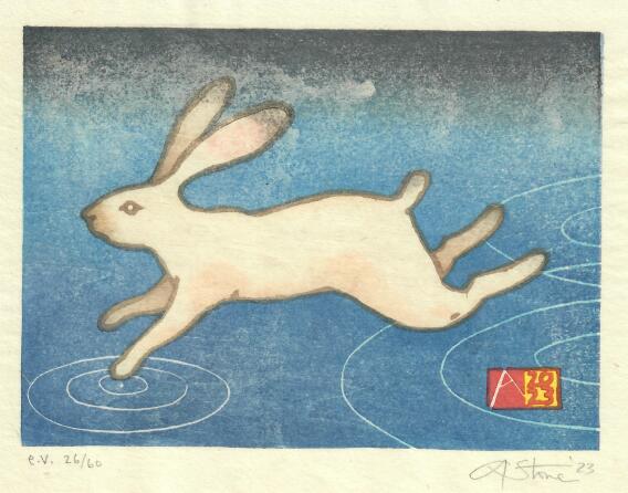
Fast Enough-Year of the (water) rabbit


Fast Enought, 2023, 7" X 8"  E.V.-edition size is 60 on sized Japanese machine-made washi.                 

Are you fast enough?

I wasn't planning on making a Chinese zodiac card this year.

But I started drawing rabbits, and hares, and more rabbits, until I filled a few pages of sketchbooks with running, jumping, grazing and flying "Thumpers".  I had wanted to create a busy background full of jerky marks of grass or reeds whizzing by-but the rabbits couldn't decide if they wanted to be white rabbits on a dark ground, or brown rabbits on a green field- and each time I tried to go one way, the rabbits would run back in the other direction. So my white rabbits kept getting beige fur and black ear and tail highlights, and the brown rabbit was never really dark or real enough.  

But then I remembered it was the year of the WATER rabbit.  And that sort of made the background obvious.  

When almost every other animal you meet wants to eat or hurt you,  it's no surprise that running away is the most natural response to almost any stimulus.   But the hares of our fields first do their best not to get noticed.  They blend in to the tall grass and branches, and hunker down, immobile, and are almost impossible to see.  But if you get too close, or startle them with a brusque movement or noise, they will explode from almost underfoot, and rocket away, zig-zagging across the field and will cross a long distance before they will glance back to make sure they're not being followed.  I will never walk on water, but trying not to be noticed, or running away at the first sign from real or imagined conflict, are habits I recognize.

The format was driven by my participation in the BarenForums latest exchange (91).  The paper size is 7" X 8" and 20 copies went to that print exchange. 


The streaking at the top, is from a little too much size-the glue and alum that I added to the paper.


Sunday, June 26, 2022

"Fixing" things? Some of My Favorite Shapes....


 I did this little 4" x 6" pencil sketch on a long flight back from Japan three years ago.  I often fill a sketchbook quickly, filling a page with shapes or doodles, and letting the visual forms trigger ideas or lead to the next drawing.

I usually draw a rectangle, the imaginary "boundary" of my image and fill it with a couple of lines or shapes. This one was a simple idea of basic shapes and primary colors, so I drew a rough square, a simple triangle, and-cramped as I was on the tray table- a quasi- circle....I added a caption, "Some of my favorite Shapes, Hanging out together" and thus it became another etegami--It was too awkward to color it in on the plane, so I turned the page and filled the sketchbook with many other similar drawings. 

 I've gone back often to that notebook and always thought about turning this into a very simple print.  I pulled out a few blocks, some tracing paper, and started to figure out how to interpret this.   One option would be to simply copy it exactly-there are ways to do that and I could reproduce almost exactly my original drawing.  BUT since I have to manually get it onto the wood, there is also an opportunity to adjust or fix the original drawing--maybe moving the text if it looks cramped or awkward, or in this case, maybe tweaking some of those OBVIOUS exaggerations I made in the original drawing (the square is actually a rhomboid, and that circle is NOT a circle)....and I will confess I did get out a compass, and adjust the circle to bring it closer to a geometric shape, straighten out the sides of the square, and tweak the triangle a little bit......

 But, that then makes other things look odd, and I realize that maybe it wasn't a great idea....as a rapid gesture drawing of imagined shapes, it has a quirkiness and spontaneity of something done quickly, just to get an idea on paper, that I really like, and that is very much how I usually do things.  Instead, once it gets corrected, it becomes more of a formal exercise of the relationship of geometric shapes and the negative space surrounding them (things explored very well by LOTS of great artists in the last 100 years)...and now suddenlty the hand-scribbled text also looks awkard, and may have to be redrawn or omitted...?

As I drew various corrected shapes, and played with the text, adding and moving letters to fill the empty spaces,  I tried to see if I could find a happy place between the two approaches. But once I realized that my vacillation was killing any hope of working--I just picked one of my attempts: one closer to a "real" circle and "real" square than the original.  (Made easier by using a collage....).

I'm going to go with this one.

But I still haven't decided whether I'll be carving text, or leaving it out.


Tuesday, May 17, 2022

Inside and outside the Box (Necker Cube)


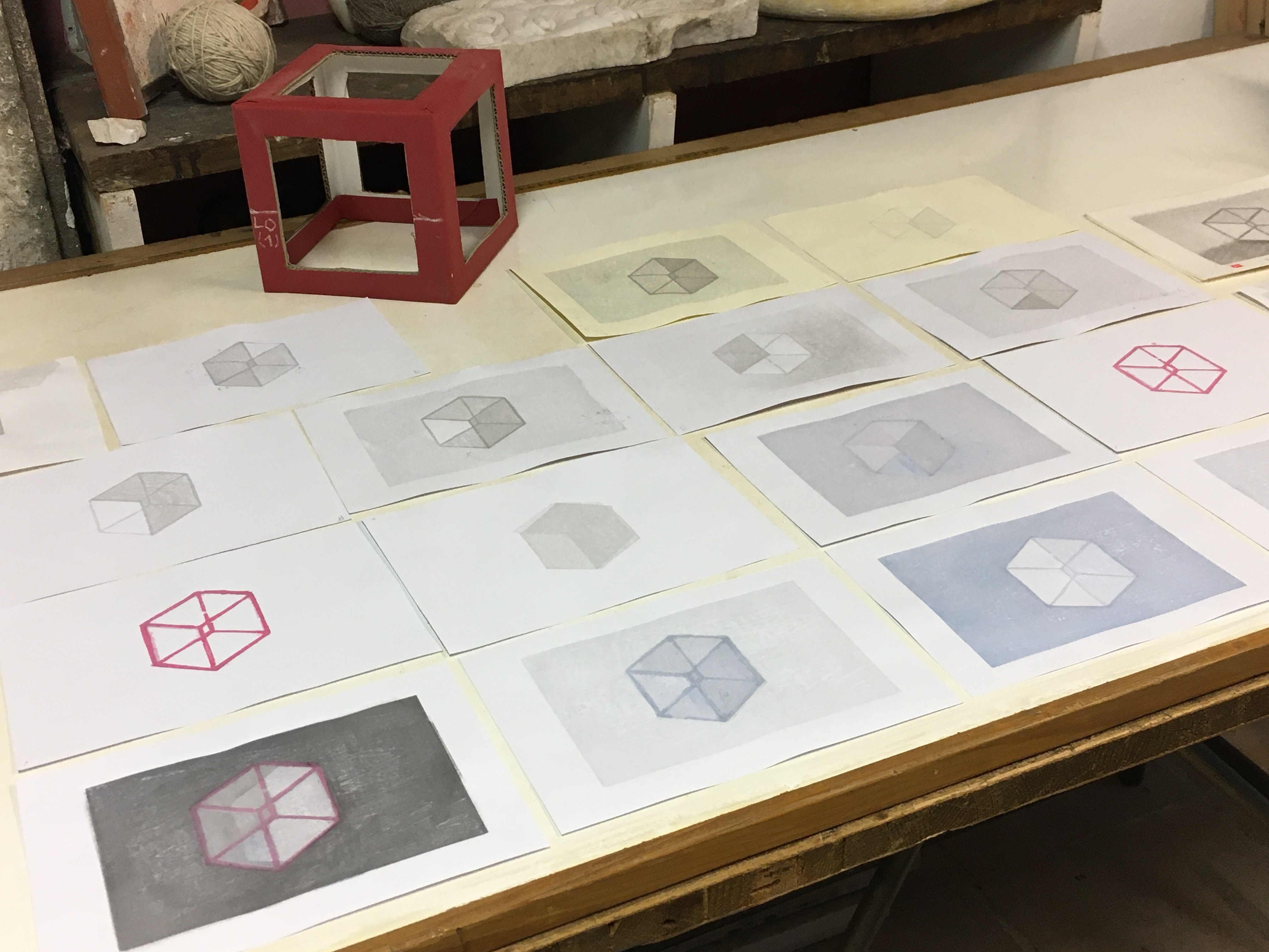
 I quickly drew this simple cube/3-D illusion (see "Necker cube" if you're curious) as a beginners' exercise for one of my mokuhanga classes from last year. All of the participants carved a keyblock line block of the cube and another of one of the face blocks so they could learn basic and proper carving techniques for lines and solid shapes prior to moving on to their own projects.

I kept their blocks and added a few more to use as demo blocks to show various printing techniques as the class progressed.  I found I liked the roughness of their carving, especially when mixing and superimposing the various duplicates on top of each other.  So after I finished with this group, I printed a few variants on leftover proofing papers.

 Now after a long hiatus myself from carving and printing, I thought I'd pull these out again.
I will be testing my new barens (the Hon-barens I made during the pandemic lockdowns) as well as some odds and ends of poorly labeled paper to warm up again to printing.

It's a bit like doodling with blocks and paper and ink....as I'm building each of these multiples by grabbing blocks and trying to add layers of color to pull forward and push back some of the planes.

Most of these will likely end up in the recycle bin but I might even end up with a couple of one-of-a-kind prints worth keeping. Most of the photos are from my studio, with poor fluorescent lighting and my phone campera lens. Their any LOTS of grays, and they don't photograph well.


This one with the idea of all of the shadows draining from a tipped over box intrigues me enough to try again with better paper and more pigment layers to build some depth and shadow.


Saturday, January 15, 2022

The only tool I have is a hammer and ALL of my problems look like nails....

If your only tool is a hammer, everything looks like a nail. 


This was an etegami that never was. I had the idea to do a postcard of an old hammer and the text was already there, the 60's-era quote from the psychologist Abraham Maslow that "If all you have is a hammer, everything looks like a nail". But I never did the sumi postcard, since I had rapidly sketched an imaginary hammer, and liked how it came out, so modified it to use as a sample print for a workshop demo. The simple line drawing was easy to turn into 4 separate plates and to show how to transfer the image and to demonstrate carving.

But that was in NOVEMBER, and with just 4 blocks, and rather straightforward colors, this print should have been done in just a few days. But times are strange, and between Covid lockdowns, waves of infection that kept me out of the studio, the need to take care of garden/outdoor projects or to assist with family matters meant that the prints got started, then stashed in the freezer multiple times. A small loss of line in a key block I wasn't sure I was going to use needed a repair, and further work was delayed by the Winter and New Year Holidays. But I finished one set of proofs, shown above. You can see very pronounced goma-zuri (speckling) that I think was due to me using either too strong a size (too much alum) or mistakenly sizing the same sheet twice....the background block should have printed the shina grain. But I like how this came out.
The top photo is a proof I finished today. It was printed on Awagami heavyweight kozo, a machine-made paper to which I've added additional sizing--there is another set, on natural-color kozo that I hope to finish early next week and on which I want to try the original idea--a version without a keyblock, using just the overlapping color plates to create defining borders to separate the shapes and forms. Either way, and despite starting this in November, this is my First Print of 2022.....

Thursday, May 6, 2021

Brayer Paintings-trace monotypes and drawings


"And Just Like that It was over. "

I have a folder of work that I've been creating, off-and-on, for a half-dozen years. These odd, mostly abstract or vaguely recognizable images I've been calling brayer paintings but they are more correctly referred to as transfer monotypes and/or ink drawings, created by drawing or painting directly onto the paper with a brayer, or indirectly by the transfer of ink off a glass plate by rubbing or marking a sheet of paper from the back, while it is face-down on a inked glass slab.  

 While I mostly work with water-based pigments and the Japanese method of woodblock prints,  I make traditional western prints too--drypoints and etchings and also occasional works incorporating letterpress text, all of which are printed using oil-based relief inks, usually rolled onto a slab or glass plate, and then transferred to the plate or mobile type. After the day's work is over, clean-up means getting the excess ink off the plate,  first by scraping it off with a piece of scrap cardstock or by placing newsprint on the plate and rubbing that to get the ink off before using vegetable oil and soap and water to wash the plate and brayer. 


Untitled, (Failing Memory)


But as I noticed that I sort of liked the newsprint or paper towels that I lifted off the glass, the ink transferred to the face down surface, it was an easy thing to start making them on purpose,  using clean pieces of bond paper--acid free printing (xerox) paper--and deliberately working to pull off ink in a semi-guided way. I could lay the clean paper face down on the inked slab, and then rub it with my fingers or fingernails, the back handle of a paintbrush or any simple implement.On others, I worked directly with the brayer, using it to draw on the paper directly and layering thin and thick layers of ink.


"Sleep and Death" (two doors).


I liked the results, but realized that I should try to use good paper rather than copy paper.  However using paper of better quality made it much harder to work freely. With good Japanese paper,  there is always a hesitation and fear of "wasting" an expensive piece of handmade paper by making a mistake or ruining a promising start, and that hindered the spontaneity and directness that made these simple works interesting.  

I solved that by (for the most part) by cutting down whole sheets into A4 size and having a folder--at hand--and reserved for just this purpose. With a folder full of paper, it's been a little easier to work without worrying too much about making a mistake.  So at the end of my occasional oil-based projects, I usually find time to make 1 or 2 pieces using the leftover ink and the wet brayer. 

I consider these part drawing, part painting, and part printmaking. They start off as abstract markings, but gradually they start to get pushed into a direction guided by the evolving image.  Like passing clouds that take on the likeness of animals or figures, my ink-slab drawings start to suggest subjects and titles. 


"Passing Storm" 2020  


Well see how far these can go.  I'd like to work a little bigger--try with a bigger brayer and a full sheet of paper--or go even bigger but with both bigger and smaller brayers or ink rollers....the key is to keep making them, without thinking too much.