Showing posts with label domino. Show all posts

Friday, January 28, 2011

Black and Blue, Again

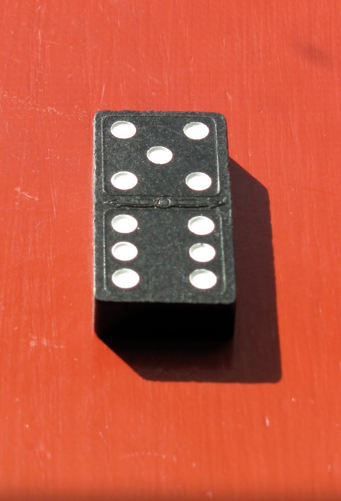
Well, this was my last attempt at proofing my Domino print before printing in earnest.

I managed to get a deep dark "black" even if this is really a deep purple; it was achieved by printing carbon black, over a rich, very dark purple, over a vermilion red, over a peach/tan.
By burnishing REALLY hard I managed to get out all the little white specks of unprinted paper. (and let it dry unpressed so there are some wrinkles).

My shadow, while a great color in itself, is too high key and warm and generally wrong for a shadow so it will have to get darker and cooler.

As for the domino body, it's dark and blue-black but maybe not as interesting as the earlier, multicolor trials.

Tomorrow, I'll start printing. I hope to print 50 copies and will probably decide as I'm sitting in front of the blocks, with all my proofs tacked to the wall in front of me, which direction I'll go in. The mood, and final print is greatly controlled by my first color--the background block and that will likely be the most important choice. (I've tried hansa yellow, yellow ochre, pthalo blue green, cobalt blue and this peach (mix of cadmium orange and buff titanium).

But first, and once again, the damp paper, despite my having cleared the blank parts of the blocks carefully is still picking up lots of stray ink and two or three of the blocks will have to be cleared again to prevent spoiling of the final prints.

Tuesday, January 25, 2011

What's the plural of DOMINO?

Well, I've been printing, pulling proofs; like Noah, two by two.

I've been trialing different color combinations and sequences of printing and several different papers. I'm having some issues with the results and while a little late in the game--the blocks are all carved after all--I pull out a REAL domino. I check out the shadows of the little divots/holes again as they don't look quite right in the print. (It's not a real comparison as this domino has divots and the one I drew has hemispherical dots.)


Then back to the studio to print a bit more....

A little more blue, a little more red, A little pthalo green---OOPS--maybe not--overprint some Cadmium Orange to tone that one down--...
The big issue for the moment is my first block is one solid tone except for the white of the dots. Printed yellow, it puts yellow everywhere and that limits the later colors that print over it. The dark shadow of the tile, in my sketch has a vibrant fuchsia in the shadow that--with transparent colors--will be impossible to reproduce if there is a strong yellow underneath. I either have to change colors or carve out the yellow block's shadow area to allow more freedom with the later shadow.


This one's pretty close to what I had in mind--even if it still isn't quite dark enough.
Hmm. Guess I'll have to trim some of those shadows a bit.....

Wednesday, January 19, 2011

Black and Blue and Gray

Well, a dark, rich black is the still elusive goal.
I'm working with transparent, water-based pigments and printing by hand with a baren on handmade, textured paper so it's harder than you'd imagine.
I finished carving the six blocks for the domino print and started try to figure out in what order to print the blocks and how.

Here is a reference trial.
One of my blocks printed with fairly dense, straight out of the bottle SUMI black ink.
It's a warm, inky black and covers very well if you paint it with a brush. But brushed onto the block and printed once it looks like this:


If I brush another layer of sumi and print it again it will get quite a bit darker but the gray tone is the white of the paper showing through--some of it is the texture of the paper and some the grain of the wood. Pressing harder will help.
I could use this as a griseille--a grey value underprinting and then attempt to print colored glazes over the top to achieve the colors I'm after.

The other way to get black is to overprint different colors. The process colors cyan, magenta, yellow and black should give you a dense rich black.


I've roughly tried that here with a yellow background layer, then a warm red, then a cobalt blue (not really cyan but transparent) and then Carbon black in 1) and Phthalo blue in 2. They are still "gray"--there's still too much white paper showing for my taste, but the mood/texture of the dark is to my eye more interesting if still
not black.

Tomorrow I'll switch the order, play with a real cyan/magenta combo and see what happens if I drop the yellow background. Today's printing has shown me that there is still some general trimming and cleaning of the blocks to tighten up the registration and get rid of some stray marks before printing the edition.

Saturday, January 15, 2011

Dominos

Well, enough of all that etching silliness. TIME to get back to woodblocks!
I like to use my woodblocks as a sort of home study course.
I've had trouble getting really dark and rich blacks and the subject of the next print is really just a pretext for this task.
Here's one of the original doodles. The domino originated as a white ivory tile with black pips (ebony wood) but for my purposes I went with the black version--usually black painted wood with white dots. I wanted something black, that I could print in a varied way and still have it be interesting.

My original sketch was of a domino with a six and a one but then, at the food store I saw this....and was crushed.
I thought about changing paths/ideas--especially as this one is a bit thin, content-wise. But after waffling and postponing, I finally just charged ahead.
Drinking some of the bottle helped. It's not bad. So I went back to the sketchbook and tried again:

This is the preparatory drawing for the blocks, colored in with colored pencils.
The liveliness comes from the handling of the color; in this case I've colored in using black, over red, over ochre, over yellow, each time laying color on the paper and the rough oak table underneath imparts an irregular surface to the color.
Achieving this kind of color/liveliness/richness with water based, transparent pigments in a block print is the challenge. I'll need several blocks and have to print each multiple times to achieve anything near this interesting....we'll see...

I glued my hanshita's down and started carving. I finished the keyblock last week; blocks 2 and 3 tonight.
Should be able to get the next three carved tomorrow?