Showing posts with label hand pulled print. Show all posts

Monday, September 26, 2016

All abuzz......

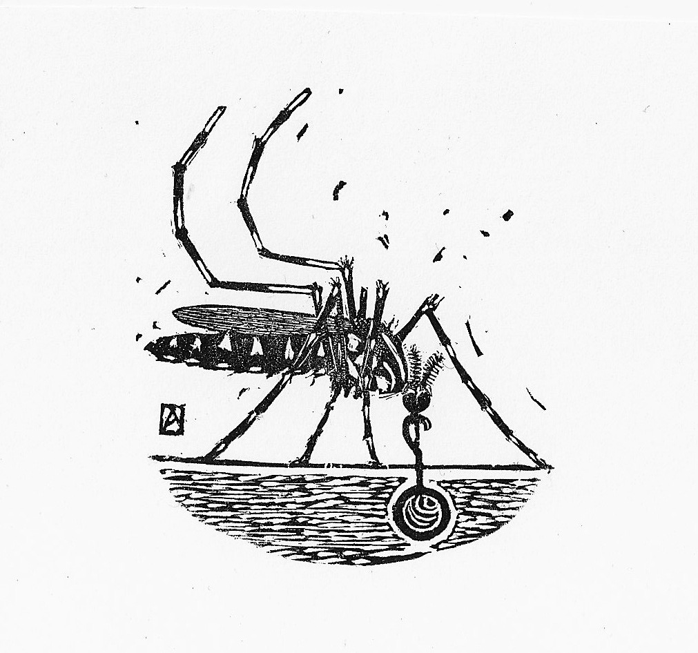
I'm participating in the Baren Forum's 70th Print exchange which has no theme but does specify a paper size (3" x 6") as well as a technique "challenge" requesting works done in the spirit of wood engraving.  The due date for finished prints is November 1st and oddly enough (for me),

I'm well on my way.
I've engraved most of the block and I'm now refining the image after taking some rough proofs.
I wasn't happy with the 1st printing--I think my ink was too thick or stiff and my paper a little too rough.
There's a lot of detail cut on the block that's not showing up on the paper and I wasn't sure whether to keep the background.
I cut out the black background with a pair of scissors and decided that I like it better. So I went back to the block with the scorpers to clear it.
Another of the first proofs, trimmed to show what it might look like without the black halo.


I've cleared out most of the background and added a tiny chop to the corner and taken another proof:
Mosquito Proof #2 (on coated bond paper)

Better.  I'm still not happy with the clarity of the legs and torso. But it's pretty close. I've a little tidying up to do with the background and try to make the legs and torso a little more readable.
I still need to set some type for the title and I have an order for paper from Intaglio print makers on the way.  So I'm on hold until the paper arrives.

There are 22 people in the exchange so I need to plan on at least 25-30 copies to have enough for all the participants and still allow for bad copies or printing flubs...and once I see how easily or hard the block is to hand print, I'll decide on the total number of copies and whether there will be both a letterpress text and no-text versions. In the meanwhile there are still some corrections to make and I need to smooth the bottom of the block to allow for trouble-free (or simpler) printing.

Monday, August 18, 2014

Stumps and flowers

Cardinal Creeper, wood engraving and watercolor; 8"x8".
About a year ago, I was walking home from the clinic on one of my last shifts of the Summer. I noted a neighbor had almost finished taking out a boxwood hedge. The tops had been sawn off and they were trying to dig and pry out the stumps and roots. My first thought was whether any could be salvaged for Bonsai....Boxwood takes forever to grow and an abandoned plant would be perfect....but these had been too badly damaged. But I asked the owner if I could grab a few pieces.....I heard boxwood was ideally suited for wood engraving....and I'd never tried it as it's become too hard to find endgrain blocks and too expensive to have them made....but I could saw off the end of a stump and these would cost only my labor.

I came back with a box, threw in the fattest trunks and took them home. I didn't have time to properly treat them; but I put half in my mildly damp studio and the others I put under the Pizza oven/which was covered with a tarp. I hoped in my year away that they would dry....and not crack too badly.


This Summer, I've been too busy with house works and other health issues to really do any artwork. But I did have time to pull out the stumps and survey the wood.  Most of the big pieces had checked (cracked) rather badly.....but I sawed off a few rounds........I sanded a couple smooth; and took the ugliest, most suited to a test carving, and continued sanding until it was glass smooth.

I drew a sketch of a plant I've been meaning to do a print of for a couple of years....
Cardinal climber or creeper (the name changes and they're not exactly the same....but it's a cross of a wild and domestic climbing morning glory). It's a great humming bird attractor and I've planted it a couple of times with little success, but last Summer my housemate Sandy got some to grow; and I took a few sketches/photos.


So armed with a subject; a sketch; a wood round; and a few engraving tools I decided to give it a go.
Since this will be only one block and the registration will not be an issue. I just redrew my sketch onto the smooth end. I tinted the block with a little greenish wash to help show the future cuts.
It was a bit of a mess; I didn't really know how to hold or use the tint--the sharp pointed tool used to outline my shapes. Nor did the scorpers---clearing tools seem to want to obey my clumsy hands.  But by the second day, I resharpened the tools,  tried holding them at a shallower angle and things started to go better. And by the time I decided I was done (parts were shaggy and ragged, others clean and well-defined). This was meant to be a test and I didn't want to expend too much time and energy on an experiment.


After one day of hacking and stuttering....

A few days later; the tools are sharper, and I'm going about it from a shallower angle.

Cardinal Climber, 8"x8" on Echizen Kozo; Akua Carbon Black Intaglio ink.
And here is the result.

These were printed by hand using a baren. I printed a few onto a Japanese paper (echizen kozo--here) and two papers better suited for engravings and etchings.

The back of the block was still uneven stump so printing was a bit of a disaster...I ended up making a clay base to hold the block, I'd lay the damp paper in place, set it with a light pressure of the baren, then pick the whole thing up and supported with one hand from behind, rub the surface with the baren hard....I got the hang of it after about 4-5.......

The few good, even impressions I'll leave alone.
The few weak impressions I'll go over as above with some watercolor.......
 
It was fun to try and the results, although crude, are appealing--I like the crisp effects the crosshatching yields, and I'm not really used to working in black and white--but I'll try to pick out a few ideas that will work well in this format and technique.  I like close hand work and detail, so it's a technique I might be able to use to my advantage, once I get better at it.


I'll let the stumps dry for another year (they'll carve better). But I'll take a few rounds with me when I head back to Italy this September.  It's a totally different technique than moku hanga, and I'll have to work really small......but I want to try another one......

Sunday, May 5, 2013

Zig Zag


Mostly ZAG  7.5"x 10" moku hanga woodblock print; ed 35


 I had this little print in my mind for some time. 
Imagined as an exercise in overlapping colors and simple shapes.
Just three colors:
Hansa Yellow
Napthol Red Medium
Pthalo Blue (green shade)
and a little sumi added in the last impression.

There was a flame-like textile in the 1500s renaissance Florence (and I can still see examples during my walks past the Antique shops in the city center) and the Missoni brand fabrics sold downtown and internationally still borrow from that design pool. But if I'm surrounded by zigzag motifs locally it was a foreign weaving that I had in mind when I sketched out the little drawing that would become this print.

The textile I was thinking about was this one:


 It's a Baluch flat-weave cover or kilim. It is asymmetric and dyed with all-natural vegetal dyes with an amazing purple and rich orange and madder red and blue. It is long and narrow and would have been used originally to cover bags or belongings in the back of a nomads tent, or as a decorative hanging in the rear. Woven in Afghanistan about 100 years ago I find it abstract and Modern in an aesthetic that seems to defy style or fashion and time.
It was in storage however (see the roof entry from late Feb) when I was working on it and I had just a vague memory of how it was constructed.   I had  the print all planned out and had finished the keyblock when I pulled it out to check for colors.
 I noted that it was pretty different than I had remembered and I'd have changed the blocks if I had seen it earlier.
(I'd have included the steps in the diagonals--they add a lot of energy).

The Yellow block I printed very strongly to allow the later green and orange to glow.
The red was printed medium strength and the blue fairly lightly to allow for a nice green and purple--and then reprinted (using a different block) to deepen just the blue stripe and the outlines.

Very simple but not all that interesting in the end.

The original textile is much more captivating and beautiful. This is once again one of those examples where the original idea remains far more interesting than the finished print.
But I am working towards getting stronger and more vibrant colors--- this is a far cry from the wan and weak colors I was still getting just a few years ago.


The bright white version on Magnani incisioni printed surprisingly well; I only used these for proofing the blocks as they're still pretty hard to print by hand and the reject rate (due to slippage) is higher than with the thinner and more transparent Japanese washi.

TheWashi edition (on Mura Udabon Smooth from the Japanese Paper Place) has a nice imprinted wood grain--the paper is dried on wooden boards; and LOTS of little inclusions that became more obvious during printing as they acted as a resist to the colors.

It was my contribution to the Baren Forum Print Exchange #56 and 31 copies went by post to L.A. yesterday. 

Saturday, January 26, 2013

Snakes


Vine Snake; proof state. Moku Hanga woodblock print.


I had rather optimistically brought my tool box and brushes with me when I came back to Santa Cruz this month.
I'm working in the local Urgent Care clinic as they're still short. It's flu season so they're really busy and between working, charting, sleeping and other sundry tasks and obligations I wasn't really sure I'd have time.

But I did have one block of cherry plywood from my favorite wood block art supplier McClains.
At 8 x 10" it was perfect for my little postcard-sized snake print as I could get two plates off each side; two in cherry and two off the birch ply that makes up the back.

So here is my four-block (off one block) proof of this years
YEAR of the SNAKE card.

It's just a proof.

The "mouse" brown I wanted for the background is more of a crap brown and has to be changed but registration and carving are good enough.

I can't decide about another block though.
 I think the background--effective in that, "this is a Japanese-style woodblock so open space is ok" look but I'm thinking of cutting and printing a subtle leaf pattern/vine/scroll thing to the background. Since this is a VINE snake and lives in the jungle/brush it would certainly be species-appropriate.

I think I will try to carve and proof one more block if I have time.
I still have two shifts in the clinic and I head home next week.I definitely will NOT have time to print the edition before I leave so once again I'll be tossing blocks, brushes and tools in my suitcase on my trip back to Florence--where I'll still have distractions but hopefully not so many as to keep me from printing 100 little green slender serpents!

For those that like to see printing sequences;
Dalomar Yellow


PthaloBlue for snake


mauve printed twice

Thursday, January 12, 2012

Maple Proofs

Well my first creative act of 2012 was to scrape the year 2011 off the keyblock for my slow-to-move-forward Maple branch print. I have been working on it but it just seems to be taking longer than it should. I did go ahead and carve a new 2012 on another block.

My first attempt at proofing was a disaster as my keyblock shifted on all 3 copies making it impossible to see if the registration of subsequent blocks was on.
So last night I had another go.
2 pieces of shin torinoko, one fabriano artistico, one Magnani watercolor paper.

Registration is decent but not perfect. The leaves are too orange/red and not variegated enough--I'll need to play with them during the actual printing.
And I'll need to trim down a bit some of the blocks and adjust at least one kento.
Here are the two variants that look ok.


The biggest problem is with my Shina plywood blocks. My Italian "white glue" didn't completely wash off the block and there is a thin layer acting as a partial resist. This is pretty evident here where the brush strokes are fairly visible (and wouldn't be exactly reproducible) but worse, as I continued to print the seams began to print quite visibly. Not sure yet what to do about this. Ignore it or try and work around it. The same board on the other unglued side also was starting to show the seam when printed too so it is not just the glue.

The atmosphery speckling of the darker copy is due to the watercolor paper. It can be printed more evenly by pressing harder with the baren but I was mostly checking registration and trying to get an idea of color fields. I like how it looks but it really is a defect of printing.

Friday, December 30, 2011

Imagining Baluchistan

Here are two versions of a small print I've been working on.
They are about 4" x 8" in size.
The first is printed on a small fragment of my home-sized Japanese paper;


the second is on Magnani a handmade,190g/m2 watercolor paper that I've been trialing to see if it would work as a locally available paper.

The shape is based on a rug motif from a small Baluch pile woven bag that I pulled out of storage recently. This is a close up of a small pillow bag or balisht, woven by the Baluch--a nomadic tribe that inhabit parts of what are now Pakistan, Iran, and Afghanistan. Balisht were/are small bags, woven in pairs that were part of a young woman's dowry and would have been used for head pillows or storage. Old ones are still found in pristine condition suggesting that they are not used but stored away as valued items. This one has a repeating motif of double headed arrows on a camel wool ground.


I had this motif in mind when I carved the 6-7 blocks for this little print.
It was designed to be able to play with overlapping colors--blue over yellow/red over yellow, etc and there are positive and negative blocks so I can alternate the order of printing and the effect.As with my other attempts to recall textile/rug pieces in moku hanga the results are only mediocre. It's a simple image but the prints are still too flat and the colors not nearly saturated or rich enough.

I do like however the surface I did manage to get--especially on my Japanese paper.
I also allowed the uncarved areas to print at the edges, and overprinted in tinted washes to try to get some layering and depth.

Saturday, November 19, 2011

Arrow(s)


I printed a few more proofs/test prints of my little, One-Way arrow sign.
I printed several copies on Shin Torinoko--a machine-made Japanese pulp and linen paper and about 7-8 on Nishinouchi. The latter is a tan, strong mulberry paper but it tends to vary in thickness across the sheet as well as in sizing--it turns out--and I had trouble again in getting it to print evenly and to not have some paper fibers pull up; if I pressed firmly enough to get a good even impression it seemed to want to pull up the paper fibers more often.

I printed the white arrow first using Zinc white and some rice paste and I did 2-3 impressions to get the white to look opaque and dense enough.
Then I printed the blue block. Again it seemed to require many reprints to get it even halfway dark. I started with Ultramarine pigment dispersion and a bit of paste and gum arabic and eventually after 2-4 impressions added a touch of pthalo blue to get it dark/covering enough. The wood grain is still pretty visible (which is fine) but I still think the blue should have been deeper; and the paper would have been happier with a few fewer impressions.

Next I printed the white block again, but this time with a mixture of zinc white and gum arabic and pressed very lightly with the baren to transfer this to the arrow shape. Then I lightly dusted brushed on some "mother-of-pearl" mica powder using a very soft, squirrel-hair mop brush. Then I brushed off the excess with another brush.
This mica turned out much too silver in color so I had to go back and print a light coating of white thinned with paste again to beat it back a bit so I lost much of the sheen I was after but I didn't want it to look like a silver arrow.


I think it looks pretty good if the lighting is right.
As a test print it has definitely been worthwhile.
I'm going to try a few copies on good, well-sized paper and see if I can have another go at printing--hope I can find some plain or white/uncolored mica.

Saturday, October 22, 2011

Debugging

Looking for defects.

Finished printing my Beetle print this afternoon. It took much longer than I imagined.
In this photo I'm looking over the nearly finished prints to look for any that need reprinting of the keyblock in the few prints where it didn't print dark enough and in the dozen or so in which I decided to print it last.
Each block took about 4-5 hrs to print so I spent the better part of a week printing-- one color by hand each morning. 5 blocks printed about 8 times for 80 copies=over 600 impressions.

No photos of the finished print tonight.
My camera batteries died and the scanner I have is so old it is no longer supported by my current computer.

But tomorrow I hope to upload some JPEGs of the finished prints.

Now it is just to let the paper dry; then sign, number, separate and trim the finished prints. But tonight I'll wash out the brushes and let the blocks air dry too.

Saturday, April 23, 2011

Not the Easter Bunny


Proofing continues.

I managed to print 3-4 color variants of my still-unfinished, Year of the Rabbit card.
I have the yellow block pretty much squared in and registration was satisfactory, if not perfect. I need to work on the ring over the Right eye and there was some unwanted embossing of the paper where I hadn't cleared the block well enough.

There is still to trim back or shim the red block--the red jewel is a bit out of registration...and there is a little general clean up to do as well on the rabbit block and the keyblock.

But I still think I have to play with the colors a bit and I'd like the gold rings to be a bit more visible...I may try some metallic ink. I touched in some gold gouache with a small paintbrush and I liked the effect but would prefer to print it.
HOPE to try printing later this week.....

Thursday, February 17, 2011

Frames: old friends in new clothes


I will be having a small show of my work opening March 1st in a local, popular coffee shop; this will be the first time I show my work in a public space and I'm pretty excited about it. It is a popular spot and I go there frequently; there is a good mix of construction workers, students and university faculty and locals and it will be a chance to see how a rather normal "public" reacts to my prints. There is a long wall, well-lit along one side and there should be room for 12-15 prints. I've spent the last few weeks searching local, second-hand shops for vintage or used frames; and the local stores for small frames that look suitable.

Most of my work has never been framed but instead, frantically printed, put away soon after as I moved quickly on to another idea.
It's been a novel experience to haul out the big Logan mat cutter I got at a yard sale and all the mat board I've been accumulating over the years. Since all the frames are different it's been a bit of a puzzle to figure out what goes well where.
Some is just size.
I'm surprised at how many of my works are really long vertical formats (that don't want to fit in a pre-made, standard frame.
And some of the work is trying to judge wood color: cherry? maple/natural? Brown, black or gilt.

But it is slowly coming together. I have about half of them framed and a few days off next week to finish the rest.
I'll try and take some pictures too when they're up on the walls.

Monday, February 14, 2011

Blood Dreams

Blood Dreams, Monoprint; 13" X 18"

Place your fingers to your lover's wrist or against your own neck and feel the pulse against your skin and know that in this moment, at least, you are alive.

This is another old work--one of my first forays into monoprints from 1997 in Santa Fe at an intensive 5-day monoprint workshop. I was really happy with this print but the really nice one--a beautiful blood-dark maroon ground--(this was the reworked ghost print) vanished out of the drying racks on the last day--so my first "collector" remains unknown.

I hope to revisit this with woodblock soon. I'd like to change the size and composition a bit and am curious to see how it would turn out in Moku Hanga.

Friday, January 28, 2011

Black and Blue, Again

Well, this was my last attempt at proofing my Domino print before printing in earnest.

I managed to get a deep dark "black" even if this is really a deep purple; it was achieved by printing carbon black, over a rich, very dark purple, over a vermilion red, over a peach/tan.
By burnishing REALLY hard I managed to get out all the little white specks of unprinted paper. (and let it dry unpressed so there are some wrinkles).

My shadow, while a great color in itself, is too high key and warm and generally wrong for a shadow so it will have to get darker and cooler.

As for the domino body, it's dark and blue-black but maybe not as interesting as the earlier, multicolor trials.

Tomorrow, I'll start printing. I hope to print 50 copies and will probably decide as I'm sitting in front of the blocks, with all my proofs tacked to the wall in front of me, which direction I'll go in. The mood, and final print is greatly controlled by my first color--the background block and that will likely be the most important choice. (I've tried hansa yellow, yellow ochre, pthalo blue green, cobalt blue and this peach (mix of cadmium orange and buff titanium).

But first, and once again, the damp paper, despite my having cleared the blank parts of the blocks carefully is still picking up lots of stray ink and two or three of the blocks will have to be cleared again to prevent spoiling of the final prints.

Tuesday, January 25, 2011

What's the plural of DOMINO?

Well, I've been printing, pulling proofs; like Noah, two by two.

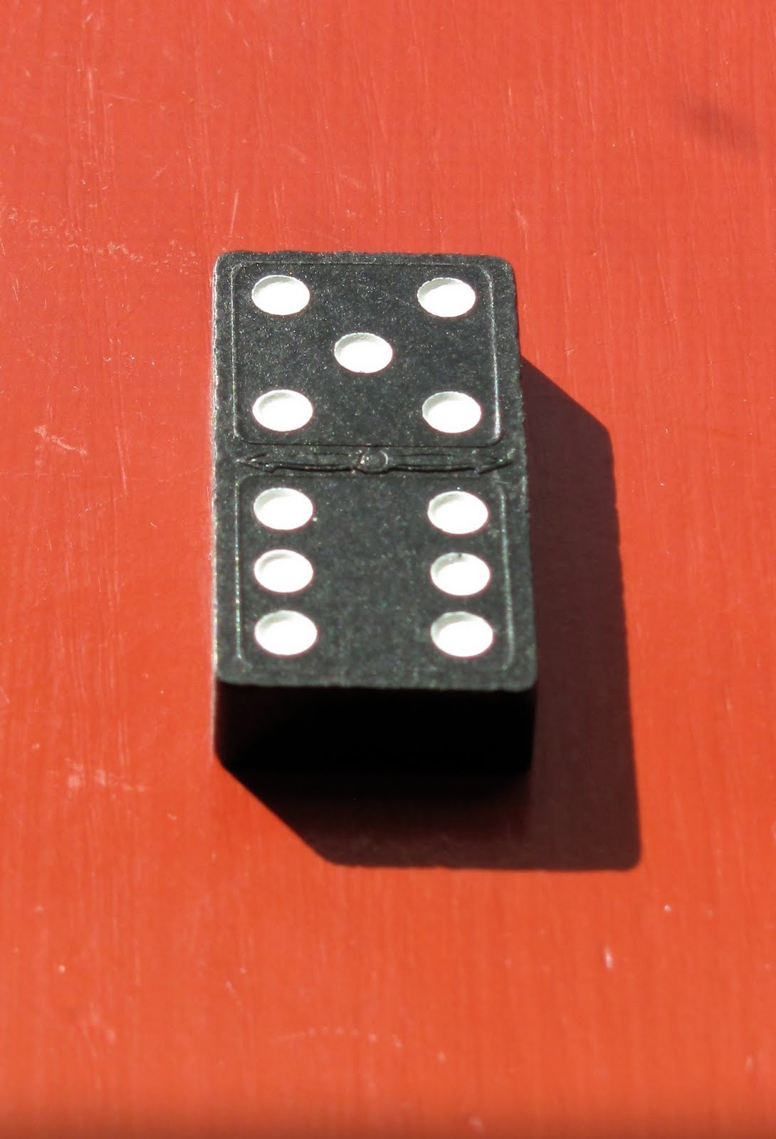
I've been trialing different color combinations and sequences of printing and several different papers. I'm having some issues with the results and while a little late in the game--the blocks are all carved after all--I pull out a REAL domino. I check out the shadows of the little divots/holes again as they don't look quite right in the print. (It's not a real comparison as this domino has divots and the one I drew has hemispherical dots.)


Then back to the studio to print a bit more....

A little more blue, a little more red, A little pthalo green---OOPS--maybe not--overprint some Cadmium Orange to tone that one down--...
The big issue for the moment is my first block is one solid tone except for the white of the dots. Printed yellow, it puts yellow everywhere and that limits the later colors that print over it. The dark shadow of the tile, in my sketch has a vibrant fuchsia in the shadow that--with transparent colors--will be impossible to reproduce if there is a strong yellow underneath. I either have to change colors or carve out the yellow block's shadow area to allow more freedom with the later shadow.


This one's pretty close to what I had in mind--even if it still isn't quite dark enough.
Hmm. Guess I'll have to trim some of those shadows a bit.....

Wednesday, January 19, 2011

Black and Blue and Gray

Well, a dark, rich black is the still elusive goal.
I'm working with transparent, water-based pigments and printing by hand with a baren on handmade, textured paper so it's harder than you'd imagine.
I finished carving the six blocks for the domino print and started try to figure out in what order to print the blocks and how.

Here is a reference trial.
One of my blocks printed with fairly dense, straight out of the bottle SUMI black ink.
It's a warm, inky black and covers very well if you paint it with a brush. But brushed onto the block and printed once it looks like this:


If I brush another layer of sumi and print it again it will get quite a bit darker but the gray tone is the white of the paper showing through--some of it is the texture of the paper and some the grain of the wood. Pressing harder will help.
I could use this as a griseille--a grey value underprinting and then attempt to print colored glazes over the top to achieve the colors I'm after.

The other way to get black is to overprint different colors. The process colors cyan, magenta, yellow and black should give you a dense rich black.


I've roughly tried that here with a yellow background layer, then a warm red, then a cobalt blue (not really cyan but transparent) and then Carbon black in 1) and Phthalo blue in 2. They are still "gray"--there's still too much white paper showing for my taste, but the mood/texture of the dark is to my eye more interesting if still
not black.

Tomorrow I'll switch the order, play with a real cyan/magenta combo and see what happens if I drop the yellow background. Today's printing has shown me that there is still some general trimming and cleaning of the blocks to tighten up the registration and get rid of some stray marks before printing the edition.

Monday, January 10, 2011

copper braid

I'm not far from San Francisco and when a colleague mentioned that Crown Point Press was having a weekend etching workshop I jumped at the chance. One of the premier fine art printing/publishing studios of mostly conceptual/visual artists' work in prints, it meant having access to their amazing studio and help from two master printers.

Since I've been having lots of trouble with my blue press--I need some help with the hands-on part--how to ink and wipe a plate, registration, multiple plate registration, etc. SO I drove up and spent two days and it was exhausting but loads of fun. It's an impressive set up; with separate rooms for acquatint, and acid etching, great lighting, OSHA regulation ventilation and safety features and all the tools and techniques available to help you produce whatever you'd like.

Soft ground, hard ground, spit bite, aquatint, flat bite, chine colle', drypoint, engraving, sugar lift, etc. etc.
Too much for just two days.

I decided to work loosely from my previous figure drawing hoping to be able to play with technique rather than fret about image and detail. I loosely traced my image outlines hoping to work on the braid in line and color as the main subject.


The initial line drawing was reproduced with soft-ground etching giving me nice, hand-drawn quality lines to the contours and basic braid and hair shapes.

Then I blocked out the figure and did a simple aquatint of the background shapes to set them back by making them flat and darker.

Next, I went back in a reblocked the figure and step-etched using aquatint the hair several times to get different tones, once blocking out with a sharpie before going back in the acid bath.

The second one was printed using a burnt umber/black mix; both on white Somerset paper using Charbonel inks.

I'm mostly happy with how it came out. I was hoping for something a bit looser and I wanted the subject really to be the braid. The drawing is a bit off/not quite naive or accurate enough but I like the way the hair came out. I'll probably still go back in with my drypoint needle and add some more wispy hairs but it's mostly done.

Friday, December 17, 2010

Man of War


I pulled several copies of the aluminum drypoint plate I made yesterday. I used a pthalo blue etching ink (Akua) and have been trying different wiping techniques/materials.

The prints are getting better but they are still printed pretty badly--too much ink here and there and too little in other places. My best luck was with a stiff tarlatan--that's what they're used for after all-- but I'll try to find someone who can show me how to wipe and if my ink is too stiff/loose. I'm still hoping to make a go with these water-soluble inks as clean up is really easy and there are no solvents to deal with.
I wiped ink on with a piece of matboard/scraped it off and then lightly buffed the plate with a big ball of tarlatan cloth slowly wiping off the ink. Then I went in with a bit of rolled/pointed newsprint to pull out some highlights and lastly wiped lightly with the side of my hand.


The last three I printed over an initial printing of a solid color using a piece of plexiglass plate.
I rolled color onto the plexiglass plate corresponding to where the aluminum plate would go later--lifted out the jellyfish body and some of the tenticles/stingers with a Q-tip and printed that first--one dark, the second ghost was lighter. Then, inking the plate each time, I printed the etching plate on top of the already tinted paper.


The last one is a true monoprint--I painted in my usual badly chosen colors on the plexiplate; blue for sky/blue for water, purple jelly, multicolor tenticles. It's loose and kind of interesting and would have worked if I had chosen colors more carefully; the green in particular was rather ill-advised.


I'll tip in watercolor in one of the poorly printed drypoints and see what that looks like.

P.S. If you get stung by one of these--hot water works best at neutralizing the stinging cells once you peel off the sticky stinging strings as best you can. They really hurt and can scar.