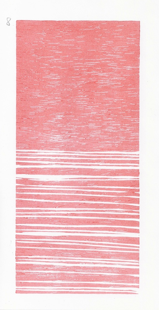
This is my second attempt at a white-line or Provincetown print. You can just make out the thin white halo around the color areas that are the hallmark of the American variant of tradional moku hanga.
A simple drawing of commas and apostrophes, black shapes on white paper, caught my eye and I played with it, changing the composition.
I liked it enough to draw it a few more times.
Then enough to trace one of those drawings onto a piece of shina, and cut out, with a V-gouge, the outline of my fat apostrophes, heavy and irregularly drawn.
Today I went to the studio and made a couple of color proofs.
Pink, Blue, Violet, Black, Mica, Sumi.
I'm not sure which I like best. The original idea was to make the forms black, on a white chalk ground on tan paper but I didn't print any like that. But I also thought about the colors of traditional printed text: blue, black, red, blue-black and ended up working with that palette.
You may not notice but the apostrophes get a little bigger as they move to the bottom row and you definitely can't see the effect of the mica powder on the background, which makes the lighter center section slightly opaque and iridescent.
1
Showing posts with label woodblock prints. Show all posts
Friday, September 8, 2017
Saturday, October 17, 2015
Baren Tests
I spent a few hours yesterday testing my home-made barens and comparing them to the professional-grade Murasaki (strong) and the ball-bearing barens that I already own.

These tests were performed on damp, double-weight, coated bond paper for inkjet papers.
It's what I use for demos and proofing as it is easy to register and prints well when damp.
Then the heavier barens were also tested on Magnani Incisioni, a 190g/m2 etching paper that I use for some of my smaller moku hanga works and that prints well when a good baren is used with lots of pressure.
Not surprisingly, the best impressions, cleanly and efficiently printed with little effort were with my $150 Murasaki Baren. More suprising, instead, was learning that my twisted-cord Barens all worked reasonably well. They needed more work and rubbing and left a lighter impression but improved greatly by printing twice.
My Thumbtack baren was too strong for this small piece of wood, printing over the grain and causing the paper to slip. With extra care to keep the paper from moving, it also gave a decent impression.
My Ball-Bearing baren was surprisingly weak on thick paper.
My twisted-cord barens all performed surprisingly well for a cheap baren made from humble materials and designed to be suitable for beginning users.
They needed more concerted pressure to get an impression, but with TWO passes, yielded very satisfactory results. This impression is from my nylon twisted-cord baren, printed Twice.
![]() |
| Baren #4, printed twice. |
![]() |
| Baren # 8 Hemp cord and vinivil |
But with care to make sure the paper didn't move, the impression was good, but heavy. The wood grain was partially lost, and there is some color that squished out here and there from the heavier pressure.
![]() | |
| Thumbtack Baren, Rives etching paper. |
![]() | |
| Thumbtack Baren/Bond paper |
![]() | ||||
| Thumbtack baren, suji and slippage. |
The Murasaki Baren printed cleanly on both the etching and bond papers.
Surprisingly, My expensive ball-bearing baren was the weakest:
![]() | ||||||||
| Ball-Bearing baren |
This was not a blinded test. I knew which baren I was using and varied the pressure and effort of rubbing to match the baren. My goal was to find out if I could get a decent impression from each baren not how they would all print with the same effort.
I'd like to go back and retest the ball-bearing and thumb tack barens to see how they perform on normal and medium-weight washi and with bigger passages of printed color.
Another fun test would be to print a small batch of prints, using different barens for each copy but on the same paper. This would allow me to see the tonal variations of the various barens in multiblock prints.
I'd also like to print a big section of color using them to see how the tack baren performs when really worked hard.
Wednesday, April 1, 2015
Cut and Paste
While I was proofing my Leafhopper blocks I was also testing the last batch of sized paper.
As I predicted, the thinner papers didn't take the size too well--the size sat on the surface and dried very slowly--(they acted as if they were already sized). So they printed a bit unevenly and then dried buckled and crinkled so I decided to back the better ones with wheat paste and washi..this will flatten them out but also, backed with white paper, will make them much more luminous.
Here I'm applying wheat starch glue with a brush across the back of the print and it will have a larger cut piece of Japanese paper glued on top and then pasted to a glass panel and door for drying. Once dry I'll cut the print off the glass door leaving the backed print dry and flat.
I'll really need to find a better recipe for the the thinner papers, although the 100 % Kozo and the mixed but heavier papers both absorbed the size well and printed nicely.
I'll try to scan in one of the better ones when they're dry.
Labels:
backing prints,
moku hanga,
sizing paper,
washi,
woodblock prints
Monday, November 25, 2013
Good Enough? Common moku hanga printing errors.
![]() | |
| Double edge from printing two blocks that don't align exactly. |
I'll Leave aside the questions of artistic merit--as a bad idea can be executed flawlessly--since I mostly wanted to touch on the conflicts arising from trying to decide what level of imperfection I can live with (or expect others to be o.k. about buying).
My early errors were fairly easy to detect and are common among beginners.
Unwanted embossing from inadequately cleared borders or empty spaces and unwanted ink blotches or spots from where the wood wasn't cleared away sufficiently and ink was being picked up by the damp paper.
These are still concerns and do still crop up from time to time--especially if I am tired or at the end of a long printing run. IF they are at the borders of the paper--well outside of the print area --or if they don't really detract from the visual impact of the print I usually allow some level of spotting. In the trash bag print the spotting was too intrusive and obviously a mistake while in the little fulcrum print, the black streaks in the gray mass/color look like, and were, deliberate-- even if there is a lot of print-to-print variability in how visible they are (from differences in baren pressure during printing).
Other early errors have mostly vanished. I no longer find myself gluing my expensive paper to the blocks from too much paste and not enough time for the block to charge with moisture and I very rarely print on the wrong side of the paper or inadvertently lay the paper down from the wrong corner throwing off the registration. (But at least one of these will still happen once with each new print I make, so I'm not immune.
But as I start to number prints in an edition that took a long time I find myself thinking long and hard about the culls. Some defects really are ok at my level of printing--they show that these are hand made; occasionally add vibrancy or energy to a print and do indeed become measures of where I am now as a printmaker. Sometimes I find myself with NO perfect prints..then I'm more prone to look at the prints I do have to try and decide if I should start over or try to pull out the few that aren't really spoiled by their imperfections.
I'll list some of the common errors that I found in my last few prints and try to post some photos that illustrate the defects.
![]() |
| The double black line is from a failed attempt to overprint the keyblock. |
Out of register; this comes (in my work) in two versions:
one is an attempt to overprint the keyblock but either the paper or wood size has changed throwing it off just a bit or I had issues laying the paper down exactly right on both impressions.
(thicker papers can often be printed exactly over and over again while thin papers are more subject to some kinking or shifting during the delicate stage of setting the paper into the registering notches).
The other is just a color block that doesn't quite mesh with the others or the keyblock.
![]() |
| Brown stripe at bottom way off; paper probably shifted before I started to print with the baren. |
The double printing of the keyblock is usually the kiss of doom for me---it's just too noticeable an error for me to allow--and it's very frustrating as the second printing of the keyblock is often the LAST impression of many.
Color bleeding: usually from printing too wet/sloppily. Extra moisture and pigment will collect at the wood edges and can squish onto the surface when printing--especially on thin papers where the excess moisture has nowhere to go.
![]() | |
| Dark Red Bokashi to tip of triangle has bled into the adjacent green. |
![]() | |||
| The orange patch at the bottom of the "grassy area" is from the pigment drying on the block. |
Sometimes, instead of too much pigment or moisture, there's too little. If the damp pigment dries on the block before you can lay your paper down it won't print. This will result in bald or uneven color patches.
This can usually be remedied (partially) by reprinting the same color again but while the pale area will now be ok, the rest of that color area will be much darker from the printing of another layer of pigment.
In this case, there's also a bit of unwanted embossing at the bottom of the paper....but I guess I decided this was ok as, unlike the others pictured here, this copy ended up in the signed and numbered pile of finished prints...
![]() |
| Good Enough? |
Tuesday, March 1, 2011
Toadprints at Coffeetopia!
Well, it's official:
Shapes and Postures, recent prints 2008-2011
by Andrew Stone
went up today and will be on display until April 15th.
We hung 19 prints this afternoon at Coffeetopia, 1723 Mission St; Santa Cruz: a local, popular coffeehouse. No photos yet, I left my camera at home and was whizzing about trying to get them all up after the shop closed. Dave the owner graciously helped hang the prints and adjusted the lighting.
All that's left to do is sneak in in the morning and put up all the identification tags of the framed prints.
There will be a mid-show opening March 25th 6-8p and I hope anyone in the Santa Cruz, South Bay or San Francisco area can come!
Shapes and Postures, recent prints 2008-2011
by Andrew Stone
went up today and will be on display until April 15th.
We hung 19 prints this afternoon at Coffeetopia, 1723 Mission St; Santa Cruz: a local, popular coffeehouse. No photos yet, I left my camera at home and was whizzing about trying to get them all up after the shop closed. Dave the owner graciously helped hang the prints and adjusted the lighting.
All that's left to do is sneak in in the morning and put up all the identification tags of the framed prints.
There will be a mid-show opening March 25th 6-8p and I hope anyone in the Santa Cruz, South Bay or San Francisco area can come!
Labels:
art show,
studio,
woodblock,
woodblock prints
Saturday, May 2, 2009
Little Red Studio

When we moved to Santa Cruz in June much of our belongings had been stored in the garage.
In the back yard however, was a small children's play shed that the previous owners said they'd found on the property. It was now full of boxes and toys but the first thing I did was claim it as my little studio. It's far enough from the house that I can pretend I'm in my own world and as our yard butts against a small creek (on the other side of the fence) I can hear if not see the babbling of running water.
It's a small space barely 5'X 10' and the overall volume is very small so printing can be problematic when the humidity is too low but its fine for carving and thinking and most of my woodblock prints have been created in it.
Today, now that the class project is over, I spent the day cleaning out the studio. That meant clearing off the table, throwing away lots of trash. Putting aside newsprint than can probably be reused for dampening paper and hanging lots of 2" to 4" wide strips of Washi, Japanese handmade papers that I cut off my paper sheets when I cut them to size. I'll use some for hinges and the others to decorate the edges of boxes or folders for my prints.
Tomorrow, I go back to work on a new print. I'm carving the end piece of a plank of cherry and I'm happy to be getting back to work. I'll take some photos of the inside of the shed too.
Sunday, November 30, 2008
more worms


Here are some more proofs from my early morning session before Thanksgiving.
The first is on torinoko cream and has a brown impression over green for the backround.
The second is on gampi and has a darker brown over green.
The third is one of the early proofs before the brown on bond paper that I kept as a reference.
The last was black and white, again on torinoko cream.
All the colors are a bit on the drab side. I think the farmer/scientist in me wants them to be somewhat naturalistic. I did one in a high key pink but it was nasty and I printed over it pretty quickly to destroy any traces.
Sunday, August 17, 2008
Shapes and Postures--a new woodcut

Here's a black and white proof of a print I just started working on. It is about 11"X13" or so and was carved on a solid 3/4" plank of poplar from the local building supply store. The idea was to try and sketch directly on the board rather than work from a finished drawing that I simply reworked in woodcut. So using an earlier sketch as a starting point and the bathroom mirror as a visual aid I sketched this out quickly in pencil on the board. Carving was a bit ragged to start until I got a better feel for the poplar and had resharpened my knives.

Here's the doodle from my sketchbook that prompted the woodcut. I have these yellow triangle people popping up from time to time in the corners and borders of my sketchbooks over the last 25 years or so. When I have enough money saved up for psychoanalysis I'll explore their origins more carefully (one of the early ones showed a Gullivers Travels-type figure surrounded by lots of these little triangles on the sand). But I'd rather get the works done first before I spend any real energy solving the issues that produce them. My wife, Benedetta, looking over my shoulder announced, "that is really repulsive"
so I know I'm on to something.
Thursday, August 14, 2008
Making Bad Wine

2005 was a bad year for the Marignolle vineyard.
In a usually unsuccessful attempt to balance the tied-to-the-land needs of a small farm and other family/marital duties we usually spend some months during the Summer away from Florence in Santa Cruz, California. While the Monterey bay area is a paradise for good food and organic vegetable and fruit production-not to mention great wines, being there in the SUMMER while our small farm is mostly abandoned is always a disaster.
When we are away, the vineyard is mostly abandoned to chance. Attempts to have "helpers" look after the vines have mostly failed. One sprayed a "little bit of pesticide" on my organic grapes "just to be safe" killing all the beneficial spiders and ladybugs and other insects that a few years of non-spraying had brought back. Another helper, a local farmer with much wisdom and years of experience just didn't like the way I was doing things and so pruned the grapevines during my absence to a different geometry, setting me back again by a year or so.
But 2005 was particularly bad. Another helper decided to "shorten" the vines to get rid of all those unnecessary leaves.
He cut the vines back to just above the grape clusters. So I returned to find these stubby little vines with a stem, a leaf, a grape cluster and then nothing.Since the sugars in the grapes come from the photosynthesis in the leaves, no leaves meant no sugars. Tied in with a cooler than usual late Summer the grapes hung on the vines and did......nothing. They didn't get riper, they didn't get sweeter. Even the birds wouldn't eat them.
We waited as long as we could; they were mostly ripe but bad weather was predicted and we thought it best to harvest.
We had the kindergarten class come out that Saturday to pick the grapes and it was a great day. We had a big picnic and the kids and their parents picked the grapes and tossed them into plastic crates. Usually we pick very carefully, picking off, cluster by cluster, any spoiled or damaged fruit, picking off the leaves or debris...it is the one real advantage we have over commercial wineries. But these were 5-year-olds. So leaves, spiders, branches and all the grapes all went in the box.
And it didn't really matter. While there was no mold, the grapes were unevenly ripe with lots of little green berries in what were supposed to be black bunches of grapes. But the worst was yet to come.
We usually and deliberately use very traditional methods. We crush by foot, ferment in small batches and intervene fairly little in the winemaking process. But we are very clean as mistakes mean spoiled wine or vinegar. We scour out the buckets with hot water and make sure everything that comes into contact with the grapes is as clean as possible. In this case it meant scrubbing the legs of lots of little kids too, anyone brave enough to hop in the crushing vat. Shoes off, legs scrubbed, clean socks put on, carried to the vat, socks pulled off, in you go. Crush, Crush, Crush. It was a great party.
But quietly, off in a corner one child discovered my compost pile. And seeing us dumping grapes in the vat crate after crate she decided to participate too. She managed to find a small bucket and a handful of compost and before anyone knew what was happening in went a bucket of finished compost into the freshly squeezed juice.
Winemaking isn't a sterile process. Wild yeasts on the grape skins are responsible for the fermentation and the grapes aren't washed so there are bits of soil, dust, bugs and spiders in every vat of wine made everywhere and the rising alcohol levels--we usually reach 13-14% alcohol levels are pretty protective. But compost in the must isn't a great idea.
But it was too late.
The choice was either dump it all out or make the wine anyway. We can't sell it anyhow and it seemed a shame to just pour it all out. So we made wine anyway.
Vino Rosso di Marignolle 2005. Marignolle (our hill and house name) 2005 Table wine. Alcohol 12% (those low sugar levels). Ruby red, very astringent, notes of blackberry branches, pruning shears, children's laughter and a hint of something else...........that I just can't place.
It's actually not that bad and since I made it I drink it, When we have friends over who insist on tasting it they always say it's good but I always notice that for the first time since we started making wines, there is always still half a bottle left on the table when dinner is over.
.
Labels:
home winemaking,
organic farming,
wine labes,
woodblock prints
Subscribe to:
Posts (Atom)