Thursday, January 9, 2014

Reading Glasses, Collars and Hames


From a web guide to horse-harness parts

It's the Year of the Horse in 2014
and horses are what I've been doodling, and thinking about for a couple of weeks now.
One of my secret dreams would be to farm with draft horses.
So I pulled out my back issues of the "Small Farmers' Journal" for reference photos and drawings.
The one I've chosen for my print is of no particular breed but has the thick neck and blunt nose common in many of the world's working-horse breeds.

I'm making use of a small piece of boxwood I've been itching to try out (see my "woodlust" post from last year) and as it's a smallish piece just 4.5" x 6" in size my print will be be only a little bigger than this.


Small means slow going. I have to carve slowly--with magnification--since the drawing will be essential in the final print; This particular boxwood is softer than I thought it would be but is holding detail pretty well although I'm not cutting the lines as thinly as they're drawn as I haven't been carving in a while and I'm feeling rusty. I've discovered if I use two sets of reading glasses I can bump up the overall magnification and it's working well except for the fact that they keep sliding off my nose.


Two mornings of work and I'm about 1/3 done with the keyblock.
The round pupil has to go however. I added it as I was carving out the iris but it's wrong. Horses have horizontal, elongated pupils and this one makes it look possessed.


Wednesday, January 8, 2014

New Studio


Nine months ago I posted to facebook (but not here) that I had taken a small room as a studio in Florence. But shortly after, the landlord sold it and although I could stay, the rent was higher than I could really justify. But I was using it and grateful to have a working space out of the house, as I was finally productive in ways I couldn't be at home.
So when the neighbors Luca and Fabrizio, who have a cooperative studio where they also offer classes decided to empty and rent out one of their four rooms and asked if I knew anyone interested I  said yes.  Me.
 I've only just moved in and still have to get things organized.  While the room I've moved into is a little smaller than I had before, the overall studio is large and I get access to communal tools, a patio, and the company of other artists.
So I've moved from my cute, tiny studio at Via San Giovanni 13R to Number 25 on the same street.

As moves go it was the easiest I've ever done. It is also at street level, on the same side of the street and only two doors down from my old one.
But since the expenses are divided It's a little more than 1/2 of my previous rent.
PLUS it has 4 decent rooms, internet, insurance, an inner courtyard and back patio and will allow me to hold classes in moku hanga once I get up the nerve....

So Look for me at:
Via San Giovanni 25, Florence at the San Giovanni School of Art.
I'm usually in the studio mornings.
Come say "hi".

Oh. This was my old studio. I gave back the keys yesterday.

Monday, December 30, 2013

Starting Over


Sometimes you just start over.
It may not be well thought out, or prudent, or financially promising, or likely to succeed, but you do it anyway.
The small farm that started this blog has been idle for years---I travel too much and and am too often away summers and winters for work in the US to have kept my word in maintaining it.

Nevertheless, when a neighbor, who had been cleaning out his artichoke patch, asked if I wanted some leftovers.....I hesitated only briefly before saying " Yes".
He asked if I had the soil prepared already and I said, "No".
He said, "you'd better start....it's supposed to rain tomorrow...."
and I left his house with about 50 Artichoke plants.....

He saved the small ones. They're really good lightly boiled and eaten like cardoons.....but his wife can't stand them.....so he didn't need many and was happy to give away what would have ended up in his compost pile.

The soil was wet and heavy from Fall rains. Too wet for a tractor and too wet really to walk in.
I used a greenhouse tool to fork the soil over, aerating it from below, then tilled in lightly some well-aged compost.  Alex and Sami helped dig shallow holes, throw in a fistful of compost and a plant and cover them with soil. A single stamp of the foot to settle the soil around them. We cut off the tops of the plants to help them avoid withering before they put out new roots. We finished just before dark and it did indeed, rain that night.
They're Morellini, the small oval purple artichokes the Italians love (and eat raw or preserved in jars of olive oil).


If things go well they'll grow new roots and establish during the rest of the Winter and early Spring and come MAY they should be a meter high and a meter across and send up the flower buds that will become our next crop....and even if we have to be gone again this Summer; we will still have artichokes to eat before we go.

Note: Artichokes (carciofi in Italian) are a common local crop.  Each plant is a biennial, growing a big, spiny, bushy plant the first year, then flowering the next. While the flowers are enormous purple thistles, they are usually picked as unopened buds which you'd recognize as an artichoke.
Only one type is grown commercially in the US (Green Globe)-- a huge, round stuffing type of artichoke) but in Italy there are many varieties and in Florence, the favorite is a small crispy green or purple artichoke that is usually eaten raw. (You can't do this with a green globe no matter how fresh it is). Each plant dies after flowering but the plant sends up numerous small suckers/shoots before it does and these will flower or produce each year. So while technically a biennial, the plant will produce artichokes for years from the new suckers.  (We usually thin them to just one per plant so they get bigger and so did my neighbor, which is why he had them to give away....).

Friday, December 20, 2013

Oops! More Common Moku Hanga Printing Errors.


I probably should have started with this one as it is one of the more common, "Oh No!" causes of printing errors--and not just for woodblock printers. The realization that the image has to be reversed on the block can be easily overlooked..... In this case, this was an early work and only the number "2" was missed....the title and other numbers were carved correctly.
Too Wet:
 The Boar print has what is termed, "tamari"; the wet, dark halos around the numbers and many of the boar's bristles are from much too much moisture and pigment on the block and it's squeezing out onto the paper instead of being driven into the fibers during the printing.


In the lower example, the mottling of the green background is caused by too much moisture rather than pigment. It seems the wetness breaks down or washes out the size and this mottling won't go away with overprinting.

The paper won't really accept any more pigment and multiple printings don't seem to get any darker or more even.


Western Papers.
 The grainy, ethereal, "atmospheric" effect is a hard to avoid defect of attempting to print on Western Papers.
The texture left in the paper surface from western paper screens during their manufacture remains and the pressure generated with the baren often isn't enough to print color smoothly.
A stronger baren, really firm pressure and certain papers are more accepting than others.
In the lizard print below, the red dewlap (skin flap) printed evenly while the blue background did not.  It is printed on Magnani incisioni which can be printed smoothly with a lot of effort (as can Fabriano Artistico).
The easiest of Western papers to use for moku hanga printing is probably Rives lightweight and I've had decent results on that paper.


Sizing issues.
If the size is badly or unevenly applied it will show up in the finished print. This looks like the sizing brush was accidentally set down and the streak of extra size acted as a resist.

Harder to illustrate is the effect of too-weak size.
Prints will simply be "flat" or "lifeless" or the colors will never seem to really be vivid or strong despite multiple overprintings.


Brushstrokes.
If the pigment isn't brushed out evenly or there isn't enough paste in the color mix (or you're using cheap brushes), the brush strokes will show.
Again, sometimes this is a nice thing.
Sometimes it is a distraction.

In this case I liked it and as in the prints above, I kept all of them, defects included.
They serve as reminders of things to watch out for going forward.
But they also record my progress (or lack thereof) as a printmaker. As I struggle to become more professional it's helpful to look back and see where I've been.  There is a naivety to some of these works that is still very appealing and I'd hate to lose that freshness and vitality in a search for clean edges and even color application.

This discussion will probably remain active for as long as I make prints. Stay tuned for the next disaster.

Monday, November 25, 2013

Good Enough? Common moku hanga printing errors.


Double edge from printing two blocks that don't align exactly.
Now that I've started printing editions or multiple copies  with the idea of eventual shows or possible sales, the issue of print quality, consistency, and printing defects are becoming more important than they used to be when I was primarily concerned with just learning the craft.
I'll Leave aside the questions of artistic merit--as a bad idea can be executed flawlessly--since I mostly wanted to touch on the conflicts arising from trying to decide what level of imperfection I can live with (or expect others to be o.k. about buying).

My early errors were fairly easy to detect and are common among beginners.
Unwanted embossing from inadequately cleared borders or empty spaces and unwanted ink blotches or spots from where the wood wasn't cleared away sufficiently and ink was being picked up by the damp paper.
 These are still concerns and do still crop up from time to time--especially if I am tired or at the end of a long printing run.  IF they are at the borders of the paper--well outside of the print area --or if they don't really detract from the visual impact of the print I usually allow some level of spotting.  In the trash bag print the spotting was too intrusive and obviously a mistake while in the little fulcrum print,  the black streaks in the gray mass/color look like, and were, deliberate-- even if there is a lot of print-to-print variability in how visible they are (from differences in baren pressure during printing).
Other early errors have mostly vanished. I no longer find myself gluing my expensive paper  to the blocks from too much paste and not enough time for the block to charge with moisture and I very rarely print on the wrong side of the paper or inadvertently lay the paper down from the wrong corner throwing off the registration. (But at least one of these will still happen once with each new print I make, so I'm not immune. 

But as I start to number prints in an edition that took a long time I find myself thinking long and hard about the culls.  Some defects really are ok at my level of printing--they show that these are hand made; occasionally add vibrancy or energy to a print and do indeed become measures of where I am now as a printmaker.  Sometimes I find myself with NO perfect prints..then I'm more prone to look at the prints I do have to try and decide if I should start over or try to pull out the few that aren't really spoiled by their imperfections.

I'll list some of the common errors that I found in my last few prints and try to post some photos that illustrate the defects.

The double black line is from a failed attempt to overprint the keyblock.

Out of register; this comes (in my work) in two versions:
one is an attempt to overprint the keyblock but either the paper or wood size has changed throwing it off just a bit or I had issues laying the paper down exactly right on both impressions.
(thicker papers can often be printed exactly over and over again while thin papers are more subject to some kinking or shifting during the delicate stage of setting the paper into the registering notches).

The other is just a color block that doesn't quite mesh with the others or the keyblock.
Brown stripe at bottom way off; paper probably shifted before I started to print with the baren.

The double printing of the keyblock is usually the kiss of doom for me---it's just too noticeable an error for me to allow--and it's very frustrating as the second printing of the keyblock is often the LAST impression of many.

Color bleeding: usually from printing too wet/sloppily. Extra moisture and pigment will collect at the wood edges and can squish onto the surface when printing--especially on thin papers where the excess moisture has nowhere to go.
Dark Red Bokashi to tip of triangle has bled into the adjacent green.


The orange patch at the bottom of the "grassy area" is from the pigment drying on the block.

 Uneven color-blank spots:
Sometimes, instead of too much pigment or moisture, there's too little. If the damp pigment dries on the block before you can lay your paper down it won't print. This will result in bald or uneven color patches.
This can usually be remedied (partially) by reprinting the same color again but while the pale area will now be ok, the rest of that color area will be much darker from the printing of another layer of pigment.

In this case, there's also a bit of unwanted embossing at the bottom of the paper....but I guess I decided this was ok as, unlike the others pictured here, this copy ended up in the signed and numbered pile of finished prints...


Good Enough?

Saturday, November 9, 2013

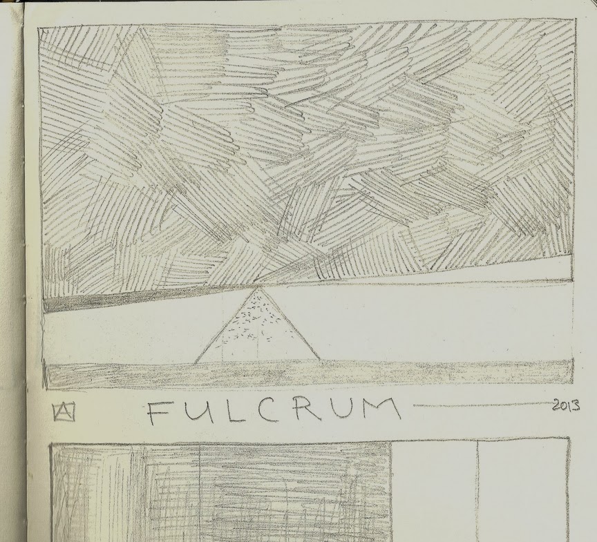
Fulcrum

Fulcrum, 6"x8" moku hanga, woodblock print

I moved into my new studio and finally had a chance to start in on the long backlog of prints I've been meaning to tackle in the last 2-3 Years.
But instead, a bit taken aback by the sudden freedom, I had trouble forging ahead and seemed a bit stuck.
Wood tends to be the muse that gets me thinking and in this case it was a box of 24 4"x6" Shina blocks I got on sale during the McClain's Summer Sale that got me working again. But, there are lots of ways to move. You can go forward, or backwards, or sometimes just pivot a bit while you wait for the momentum to build enough to get you actually moving.

This print is based on very simple drawing/a doodle really from my sketchbook done a few weeks ago--just a few lines making shapes that suggest other things.


The fulcrum is the subject and focal point but it's the large heavy mass above that interested me the most.

The color blocks were all carved in Okoume marine plywood--it has a pronounced wood grain that I tried to emphasize during the printing.

I printed this in two color variations--with either a blue or teal "sky".
One in blue and on thicker handmade paper and
Another in both color variations but on a variety of thinner papers.
All are printed on paper I sized during my last set of sizing experiments.

The only other significant variation is the addition of a subtle bokashi to the tip of the orange triangle to suggest a shadow from the mass above.
Fulcrum, 6"x8" moku hanga, color woodblock print
.


Printed from 6 blocks and about 12 color impressions.
EV of 50 on hand-sized, thinner weight, varied, Japanese papers and another smaller edition of 12 on heavy Misumi Japanese washi.


Saturday, November 2, 2013

Brushes on a budget


While I was looking for some small, inexpensive stencil brushes for a moku hanga class I taught a few months ago, I found some cheap, Chinese, bristle brushes for about $3.50 each. These were disappointing. They were too stiff and shed hairs like crazy. The students had a really hard time getting any decent coverage and they left lots of very streaky marks on their prints. So I had almost abandoned them as a waste of money. (Worse since I had twelve students and so was left with 12 brushes...).
But a few weeks ago while I was prepping some new brushes I had gotten from Japan I decided to try singeing and shaping a few of these to see how they would perform if I modified them the way I do my good brushes. Surprise, surprise they worked pretty well; on small blocks, they covered well and now that they were singed and the hairs split/tapered they spread out the color evenly enough to use them for my last print--and well enough that my "Pinwheel" print was printed using just these brushes for the color blocks.
  
before and after
Pretty good color coverage using these cheap brushes AFTER prepping them.
While almost worthless as purchased--after a trim with some scissors and a brief stint singed on a hot plate and then worked on a sandpaper "sharkskin" it's a whole new brush.

Nowhere near as soft or well-made as my professional brushes and much harder to clean but at $4.00.....I can afford to spend more time washing them...and for beginners they're more than adequate.

So after this small success I looked around the house for bigger, better quality Italian brushes:
Italian, "pura setola" brushes
I found these two brushes that were designed for painting wooden trim--the one on the left has been trimmed, singed and then worked on a piece of sandpaper to soften the tips. They too worked pretty well for moku hanga. They were a bit too soft...but color blends were decent and they're pretty serviceable if you don't need perfectly smooth coverage.

So, emboldened, I headed out to the craft store nearby that caters to the faux finishes and interior house painters....it turns out that Italy is also a pretty significant brush making country and the OMEGA line of brushes included lots of different sizes and types of bristles.

Unfortunately, they're all marked "Pura Setola" which I can only loosely translate as animal hair.....some were clearly pig bristles, some made from horse tail and some are probably ear and back hairs....some are beige and soft, some are white and stiff and some are black and coarse.


I decided to shell out some real cash and I bought two fairly big brushes and one small detail brush. They set me back $5.00, $12.00 and $17.00for the larger brushes that if they were good Japanese brushes would have each cost over $75.00.....
The above photos show the brushes as purchased (with long, flexible black hairs), then after singeing the brush to a soft curve, and lastly with the brushes finished after trimming them with scissors, singeing them on a hot pie tin over a gas flame and then worked across a strip of sandpaper for 20 minutes.
These look and feel like horse tail...they're fairly coarse....definitely a little coarser than my professional Japanese brushes.
They look pretty good.
They feel pretty good.
Definitely a little coarser and stiffer than my other brushes and the handles will be harder to use than the "shoe brush" maru bake I like to use.

I'll let you know how they work out: I'm still working on 4"x6" prints and will have to break out a big block of wood to test these brushes to see how they do.

I will say that while in the brush shop I also picked this up:

 I used it during my last paper sizing trials....and I'll post about it soon.